PELE OSAKA
Beauty salon
September 2024
Owner/PELE
Design/kfuna Co.Ltd.Fumitaka Kawanishi
Construction/kfuna Co.Ltd. Hirokazu Terada
Shooting/Daisuke Shima
OVER VIEW
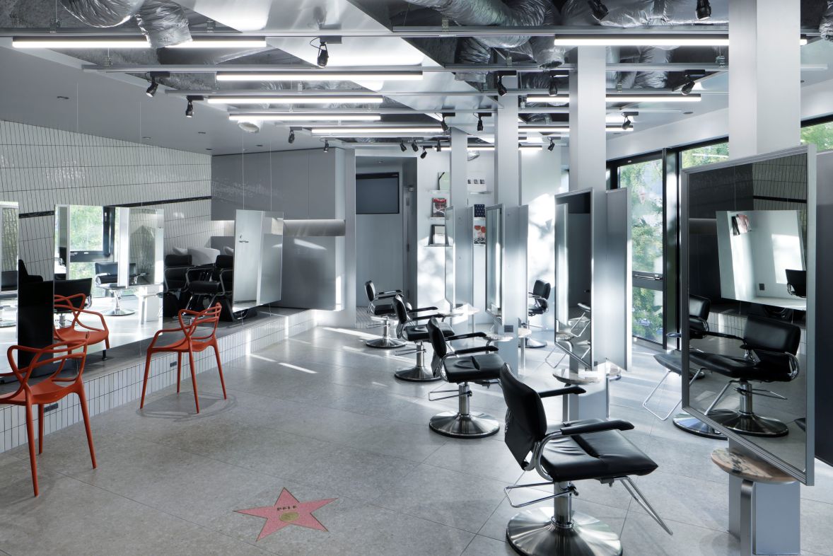
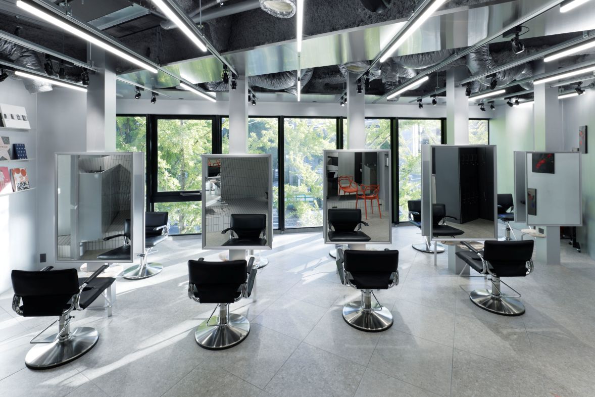
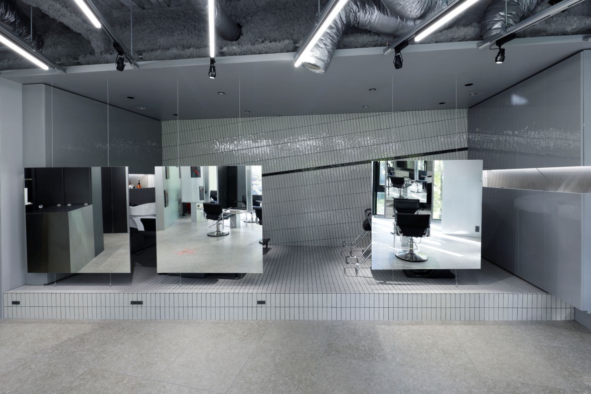
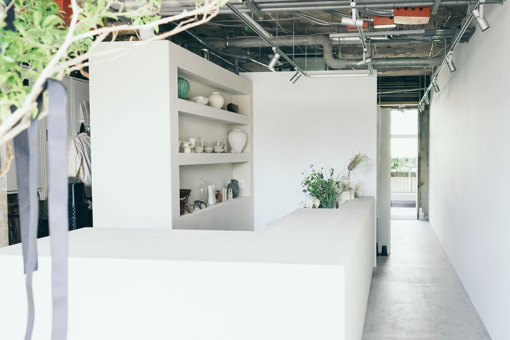
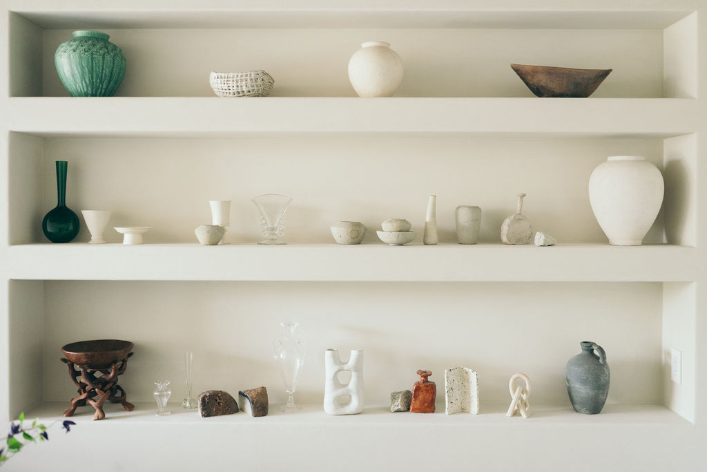
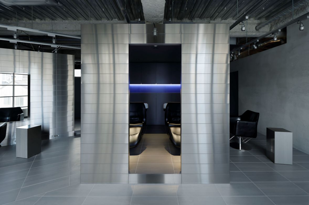
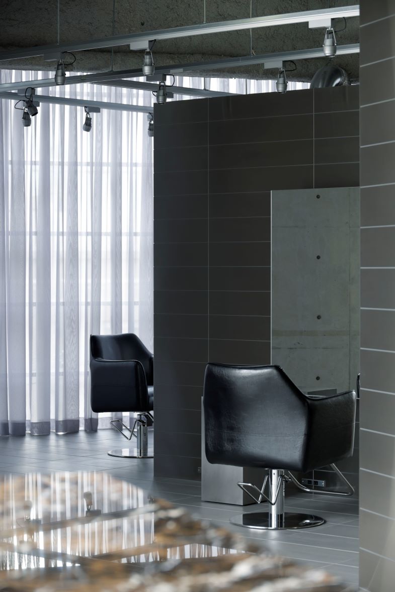
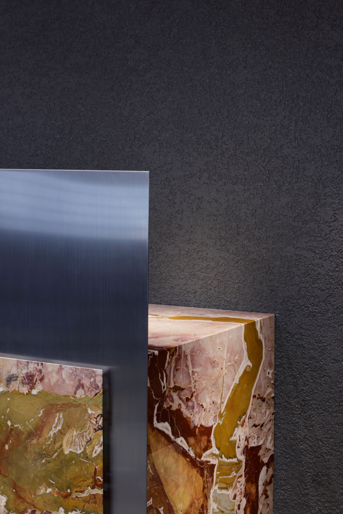
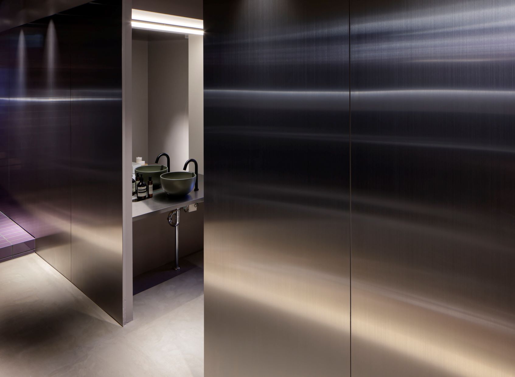
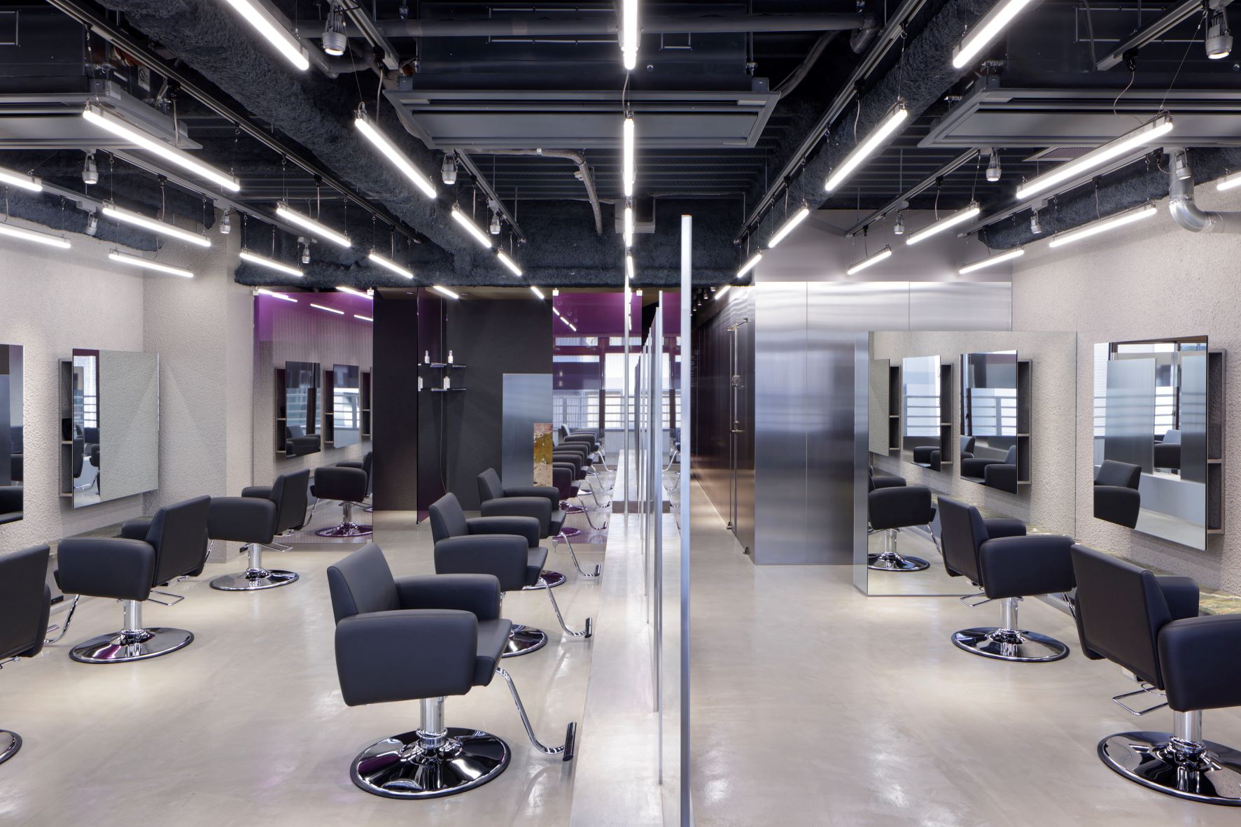
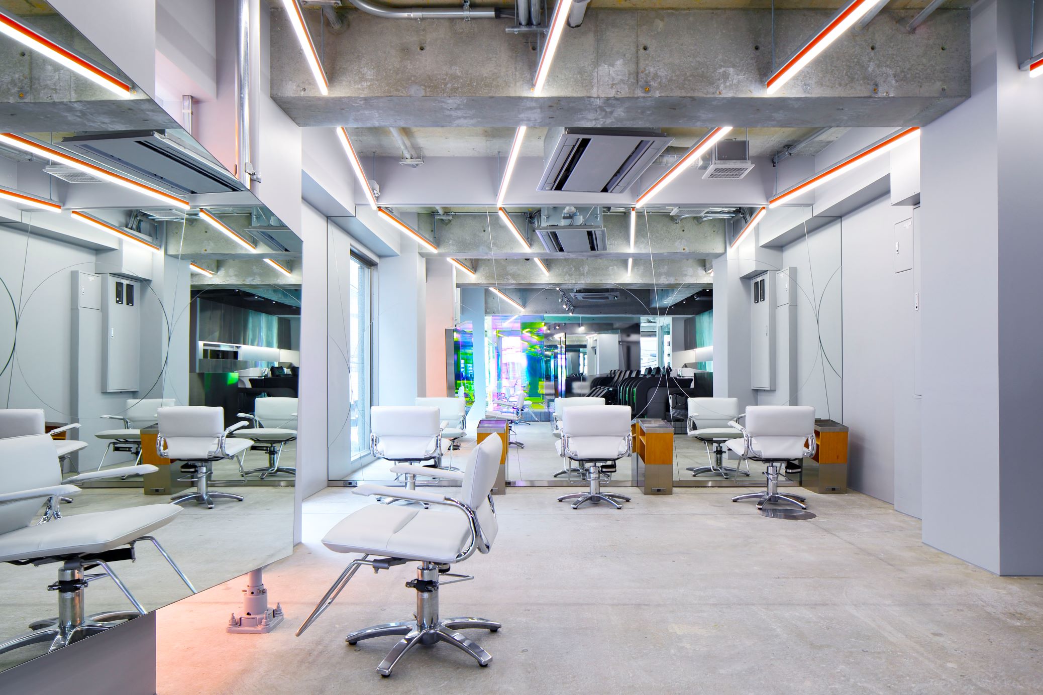
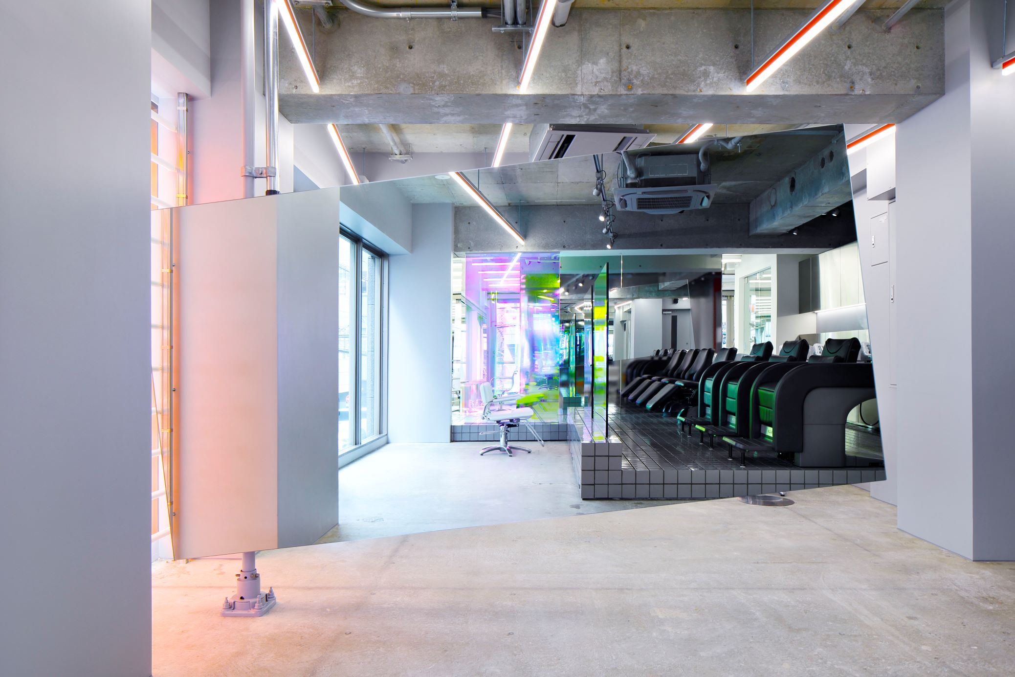
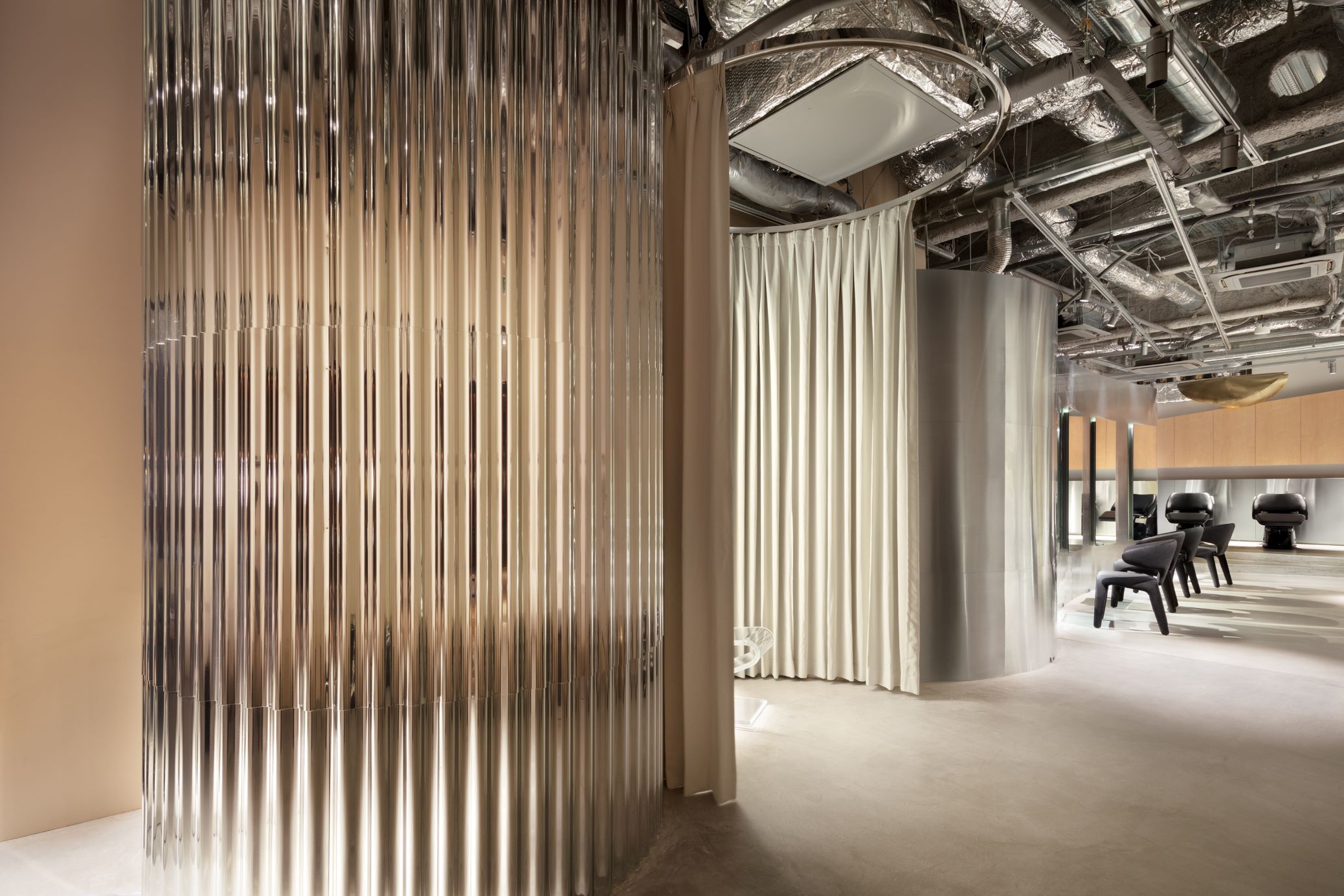
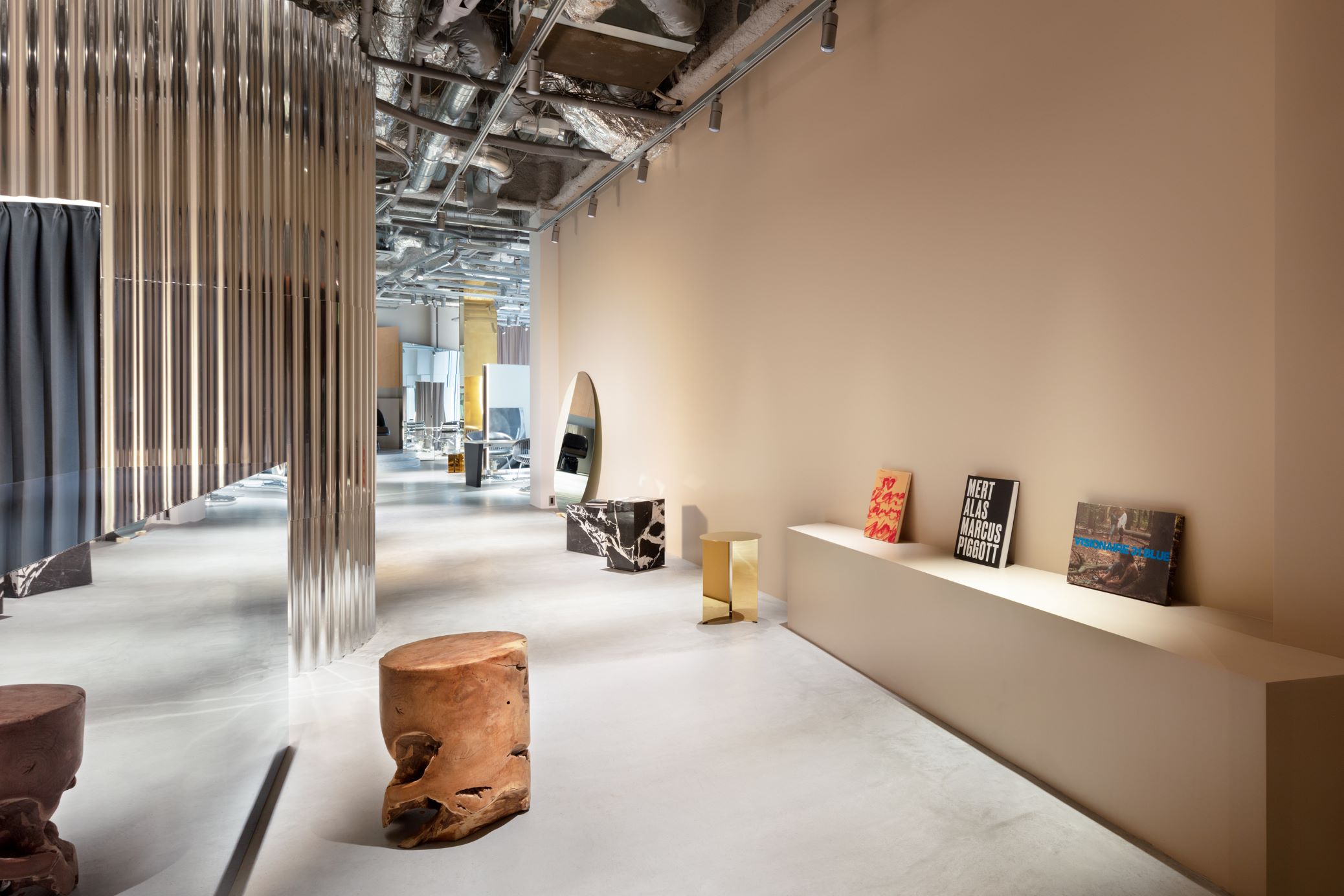
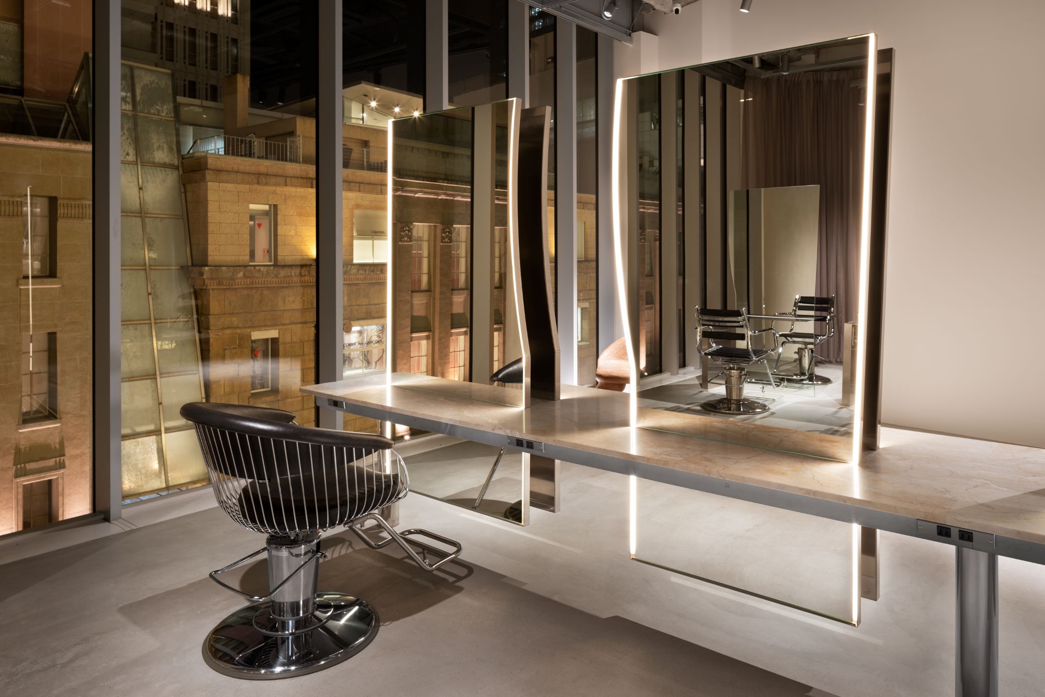
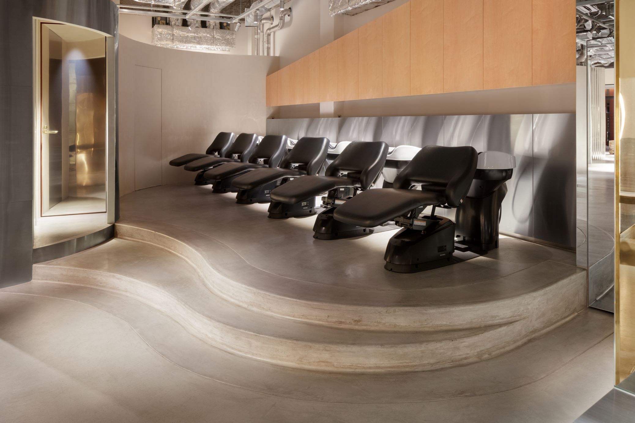
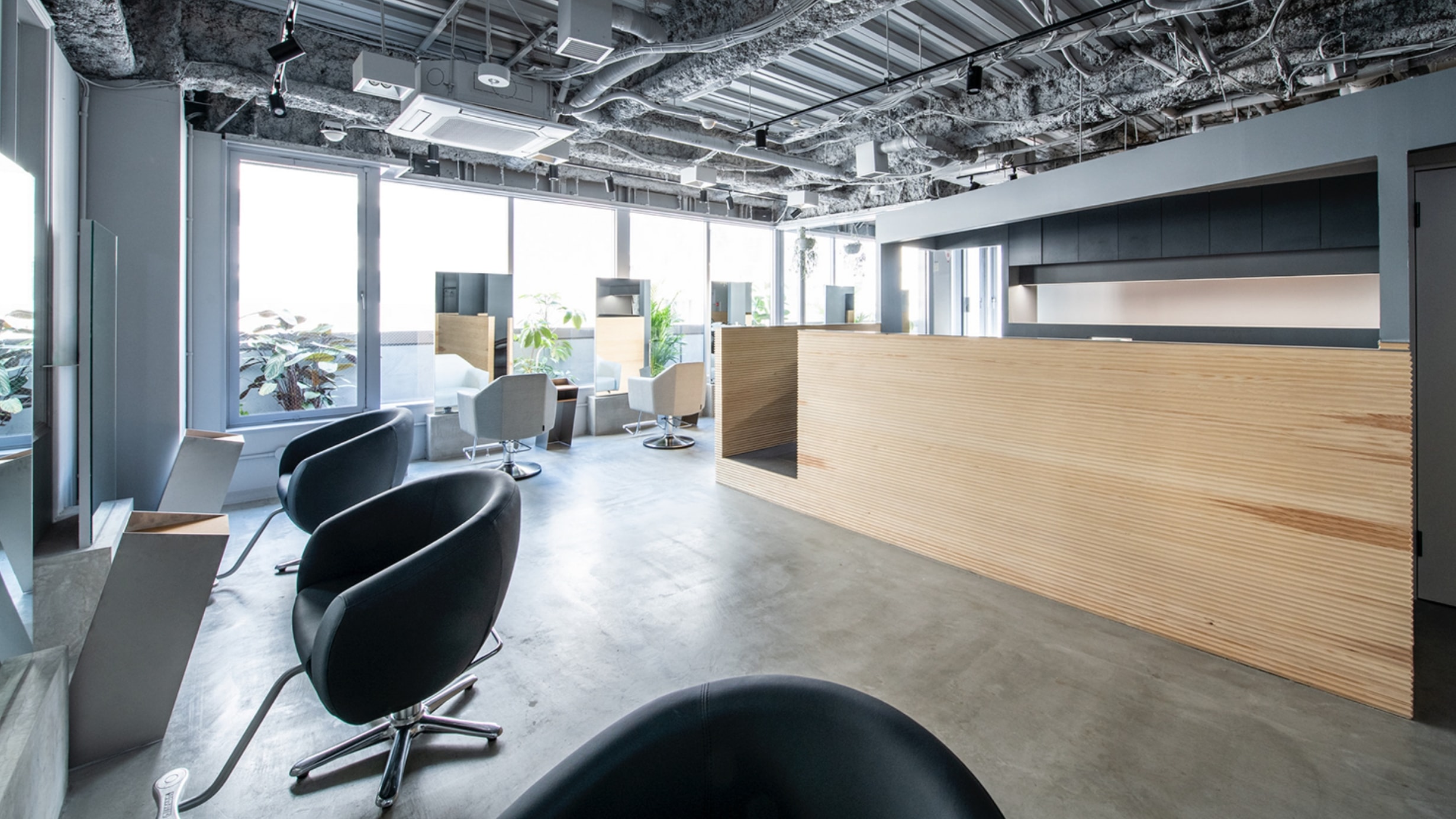
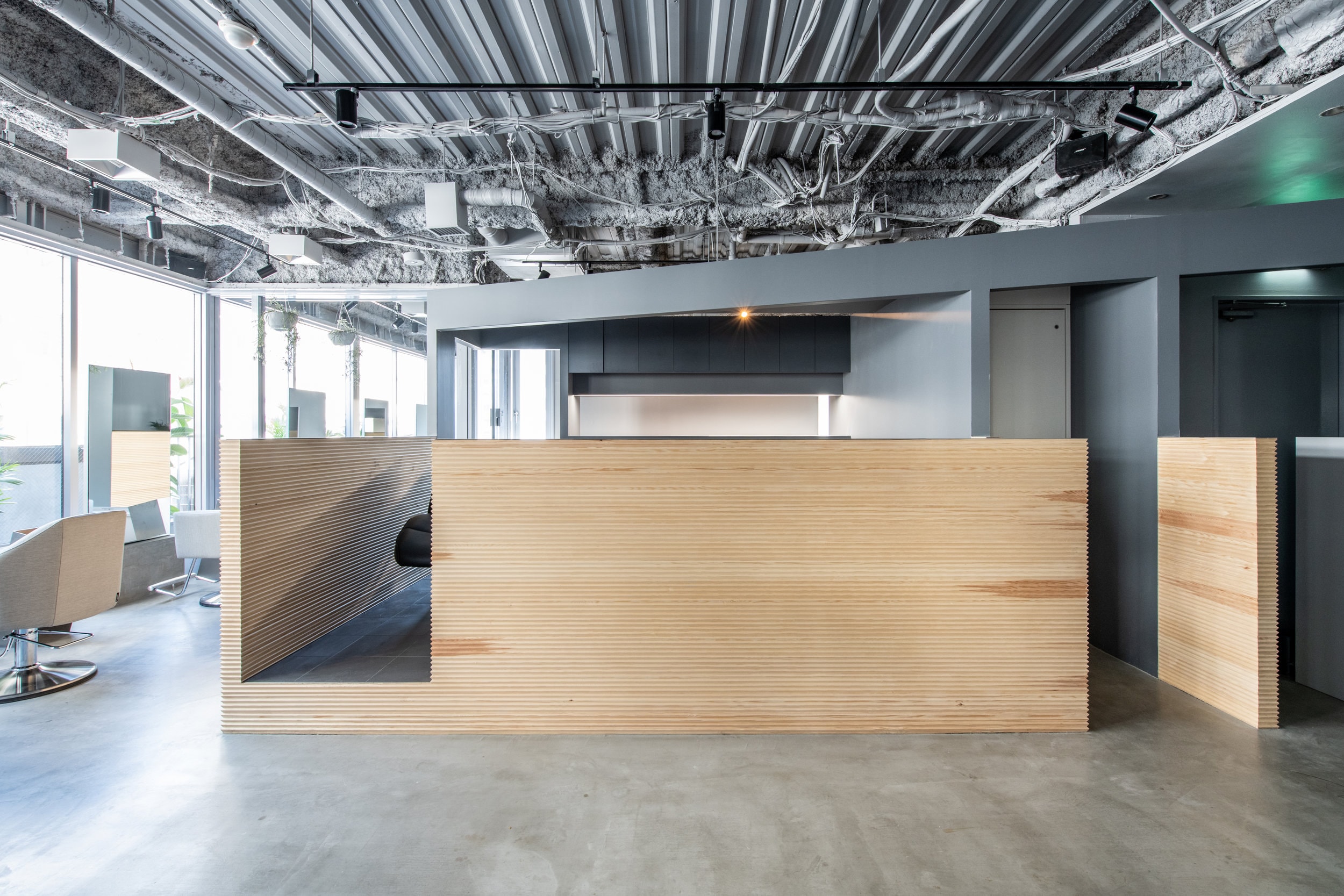
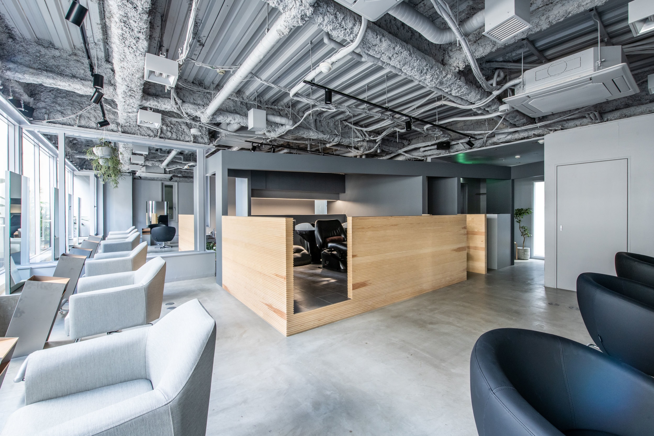
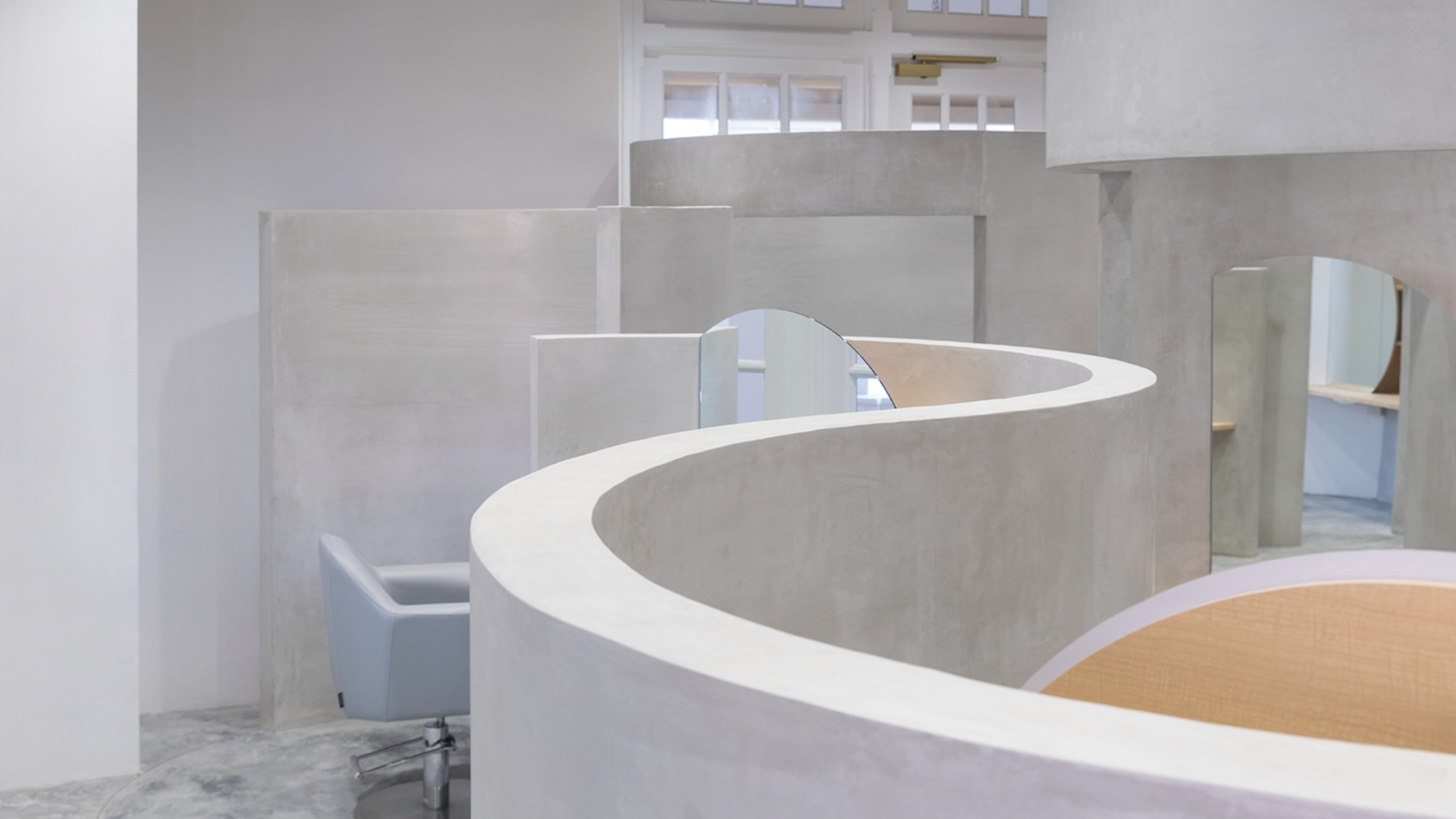
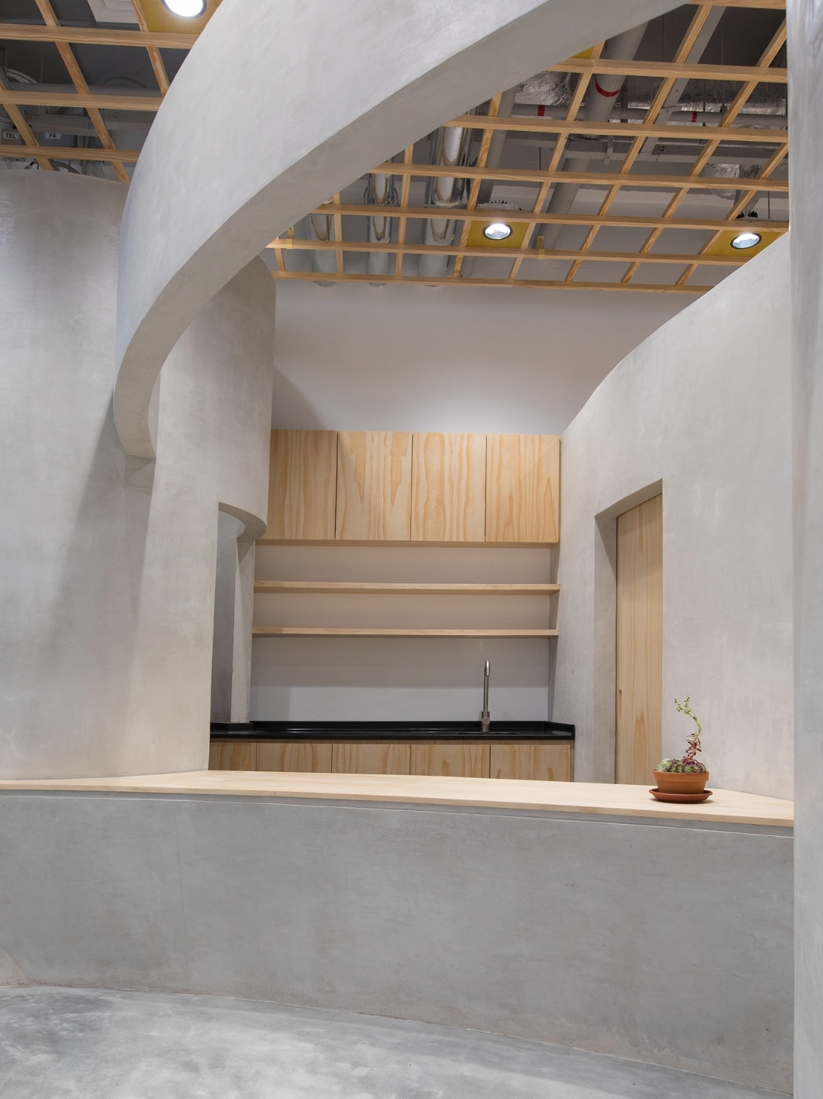
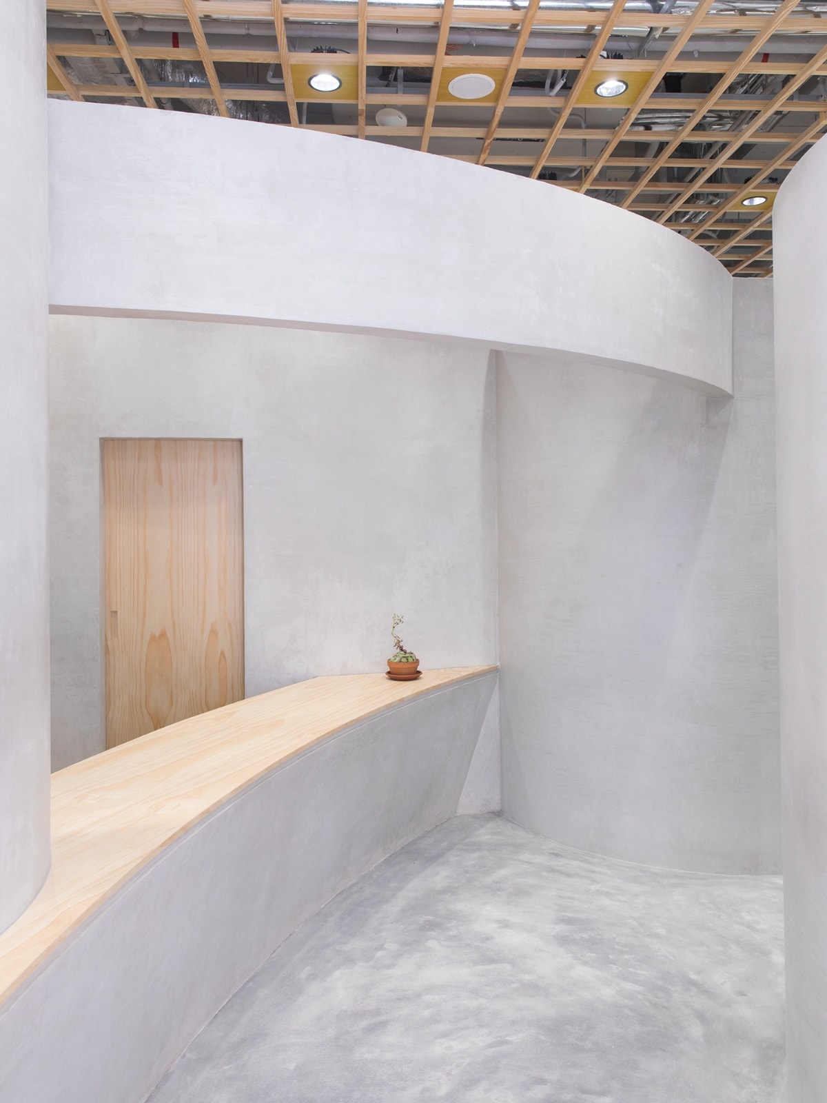
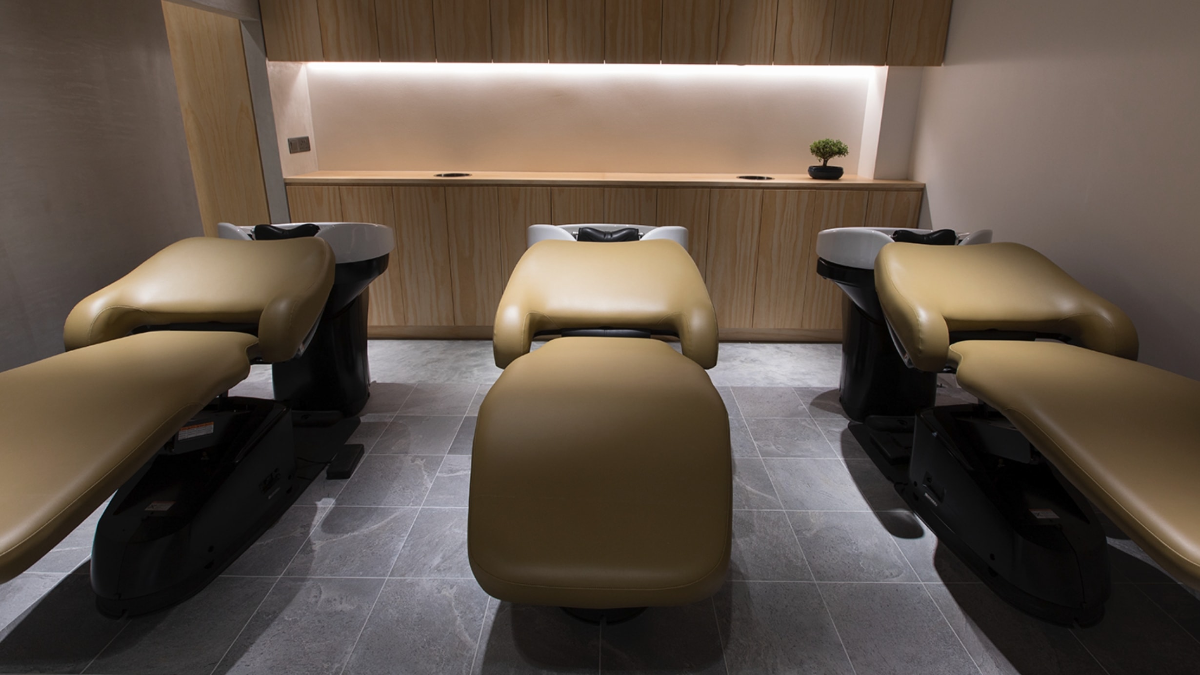
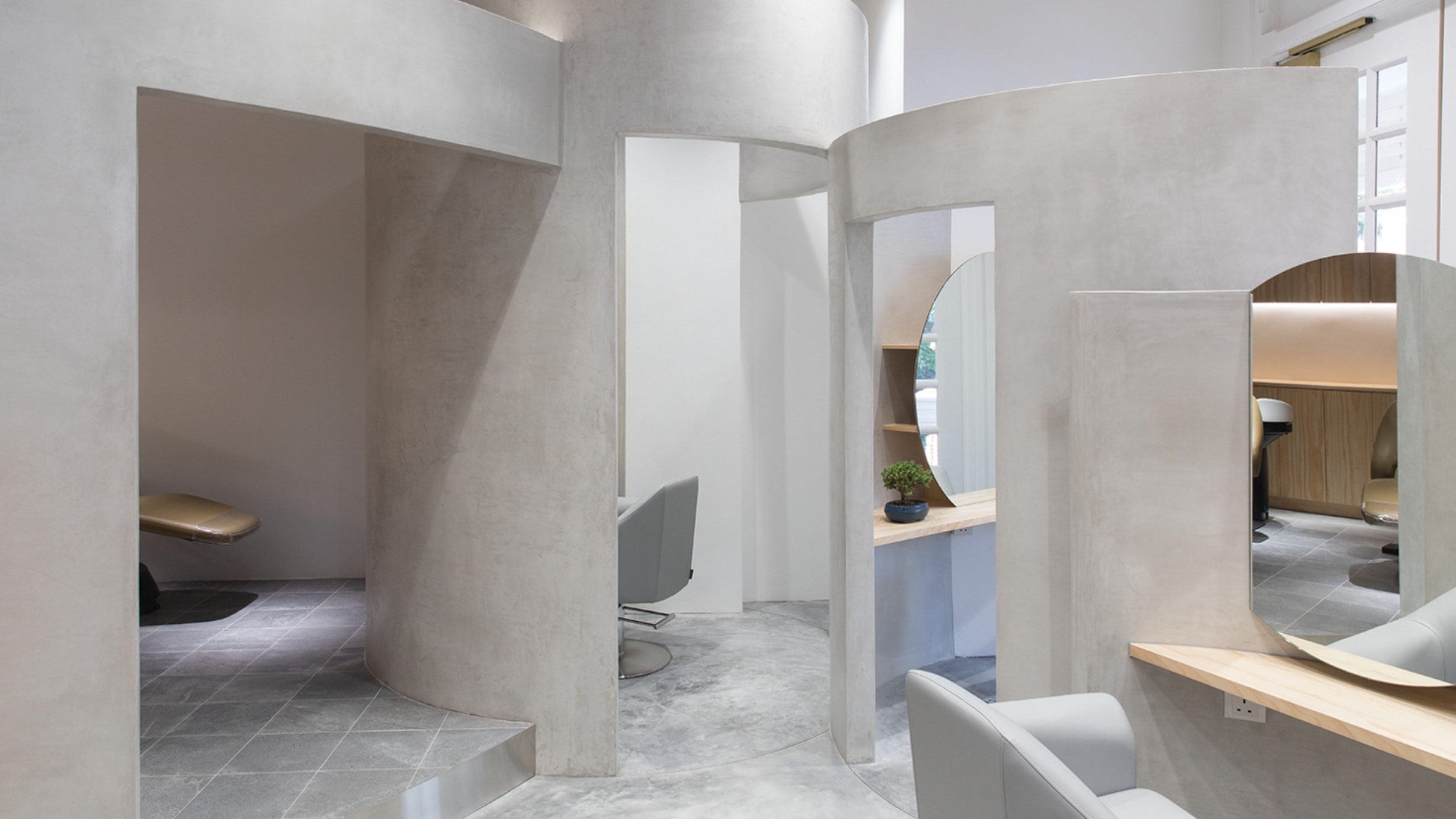
In September 2024, hair salon PELE, opened its first Osaka location, PELE UMEDA, in a prime spot within walking distance of Umeda Station. Despite its central location, the salon offers views of trees through large windows, allowing guests to enjoy the changing seasons. The design concept for this new location is "Beyond Standards." While the term typically refers to something "non-standard," here it carries a positive connotation of exceeding expectations and defying conventions.
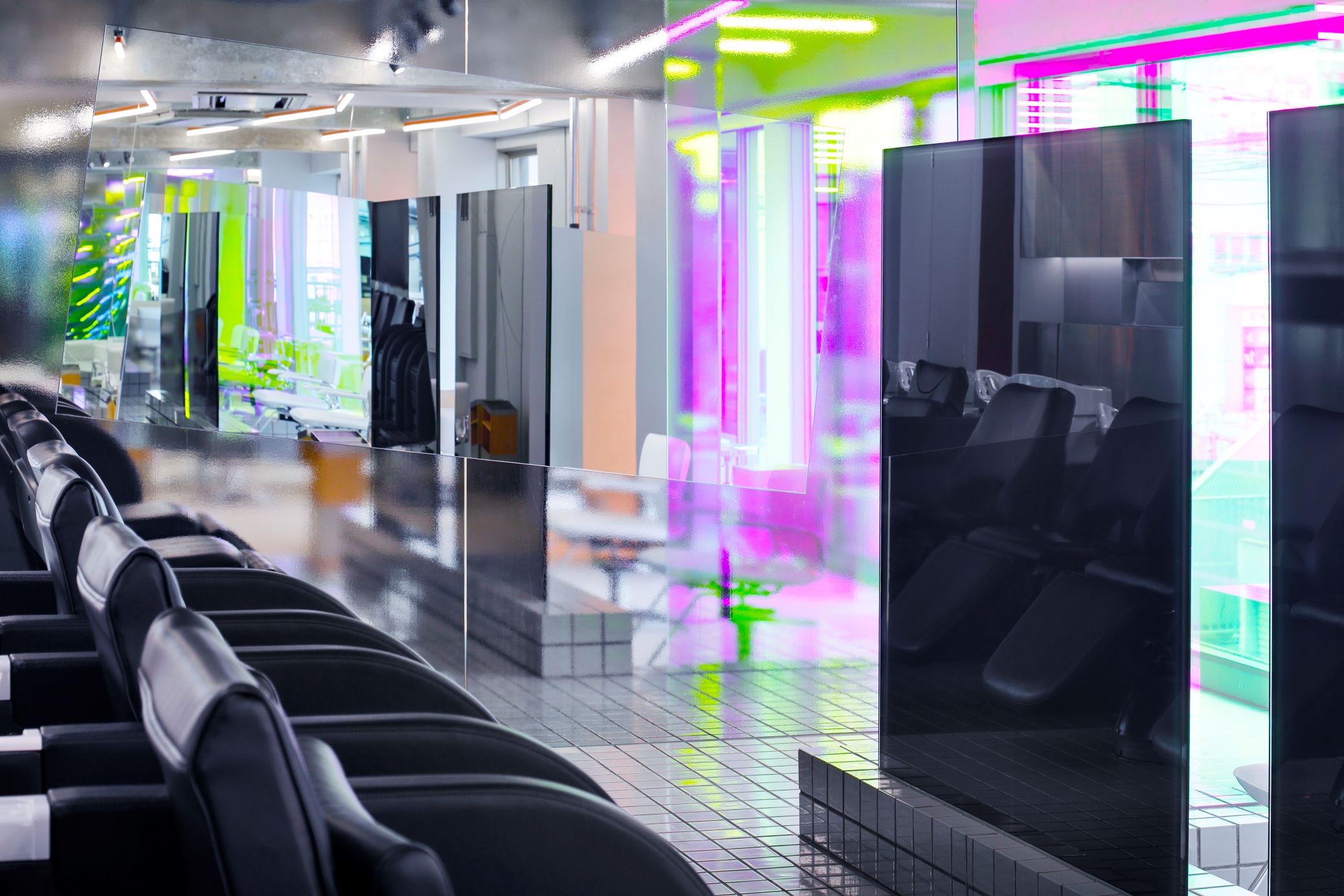
Originally crafted with more established rules in mind, the design naturally evolved, coming to stand out from its surroundings as something unique and unconventional. For example, the tiles on the floor of the shampoo area are arranged systematically from the styling section, but as they meet the wall, they rise seamlessly to become wall tiles. Although the tiling starts methodically, the angles introduced as they ascend create an asymmetry in height. To emphasize this feature, black tiles were used as accents, highlighting the way structured patterns can encounter obstacles, bend, and create unexpectedly beautiful designs. This design emerged by embracing rather than resisting barriers.
Similarly, the lighting adheres to the rule of being perpendicular to the building, but from the styling section, it appears angled, creating a sharp and dynamic impression. The mirrors reflecting the street trees are another example—each is uniquely sized, with no standardized measurements applied.
2024年9月 美容室PELE初となる大阪の地でPELE UMEDA店がオープンした。梅田駅から徒歩圏内でありながら、大きな連想窓からは木々が見え、四季を感じることができる好立地な新店舗である。今回の設計コンセプトは“規格外”。一般的に“標準ではないもの”という意味ではあるが、ここでは否定的な意味ではなく、“水準を超えたもの” や “型に はまらないもの”という肯定的な意味とした。元々は定めた法則にのっとり作られたが、のちに自然な形で変化し、周囲とは異なり、特化したり規格外と見えたもの。
例えばシャンプー台で使用された床のタイルはセット面側から法則的に並んでいるが、壁に突き当たり、そのまま壁のタイルとして自然な形で立ち上がっている。スタート時点は法則的な立ち上がり方であるものの、立ち上がると角度がつく事で高さに左右差ができたように見えた。この仕組みがわかりやすいよう黒いタイルでアクセントをつけた。これは規則的に進んだものが、ある場所でぶつかり屈折し、その屈折が偶然美しいデザインを生み出した。障害物に抗わないことで生まれたデザインでもある。照明も同じく、建物に対し垂直という法則にのっているものの、セット面からは角度がついて見えることでシャープなイメージとなった。街路樹を映し出す鏡もまた同じ大きさは1つもなく、標準を設けなかった。
T House
Newly built single-family (order) house
Jun 2024
Design / kfuna.ltd. Fumitaka Kawanishi
Construction / kfuna.ltd. Hirokazu Terada
Shooting / Yasutake Kondo
OVER VIEW
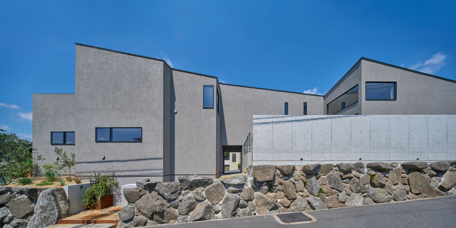
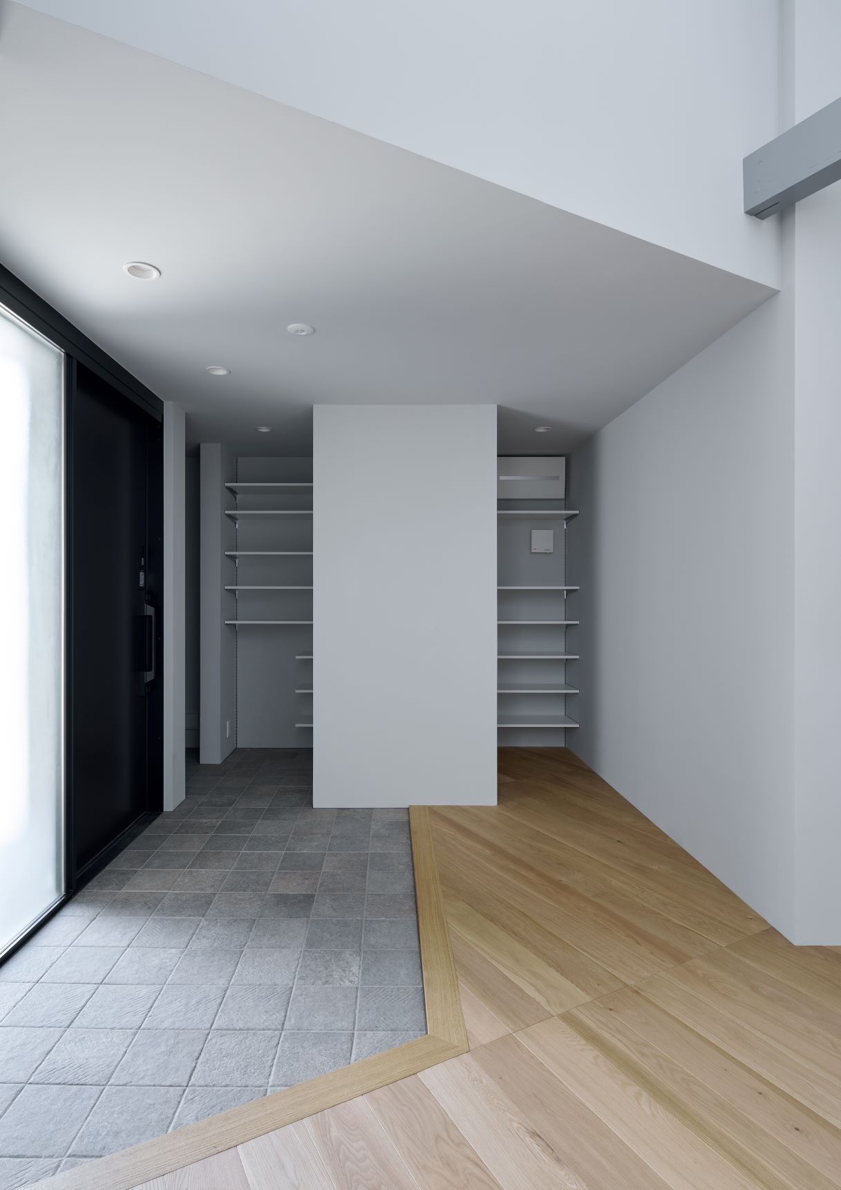
A custom home for the T family of four, designed to maximize a unique V-shaped site bordered by roads on two sides and enclosed by a stone retaining wall. The sloped terrain and strict scenic district regulations—including height limits, a 40% building coverage ratio, a 60% floor-area ratio, a two-meter setback, and restrictions on roof types—posed key challenges. Within these constraints, the client prioritized a modern façade and roof design.
To create a sleek look while adhering to regulations, a gabled roof was positioned diagonally for a single-sloped effect, and eaves were eliminated for a minimalist form. Unlike typical homes with one main façade, this site had three exposed sides, requiring a balanced design that maintained aesthetics and cost efficiency.
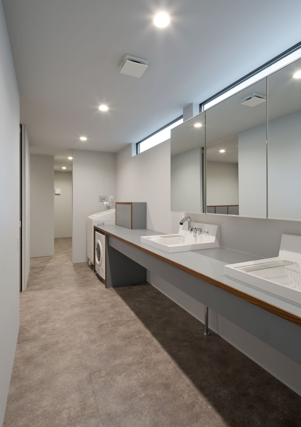
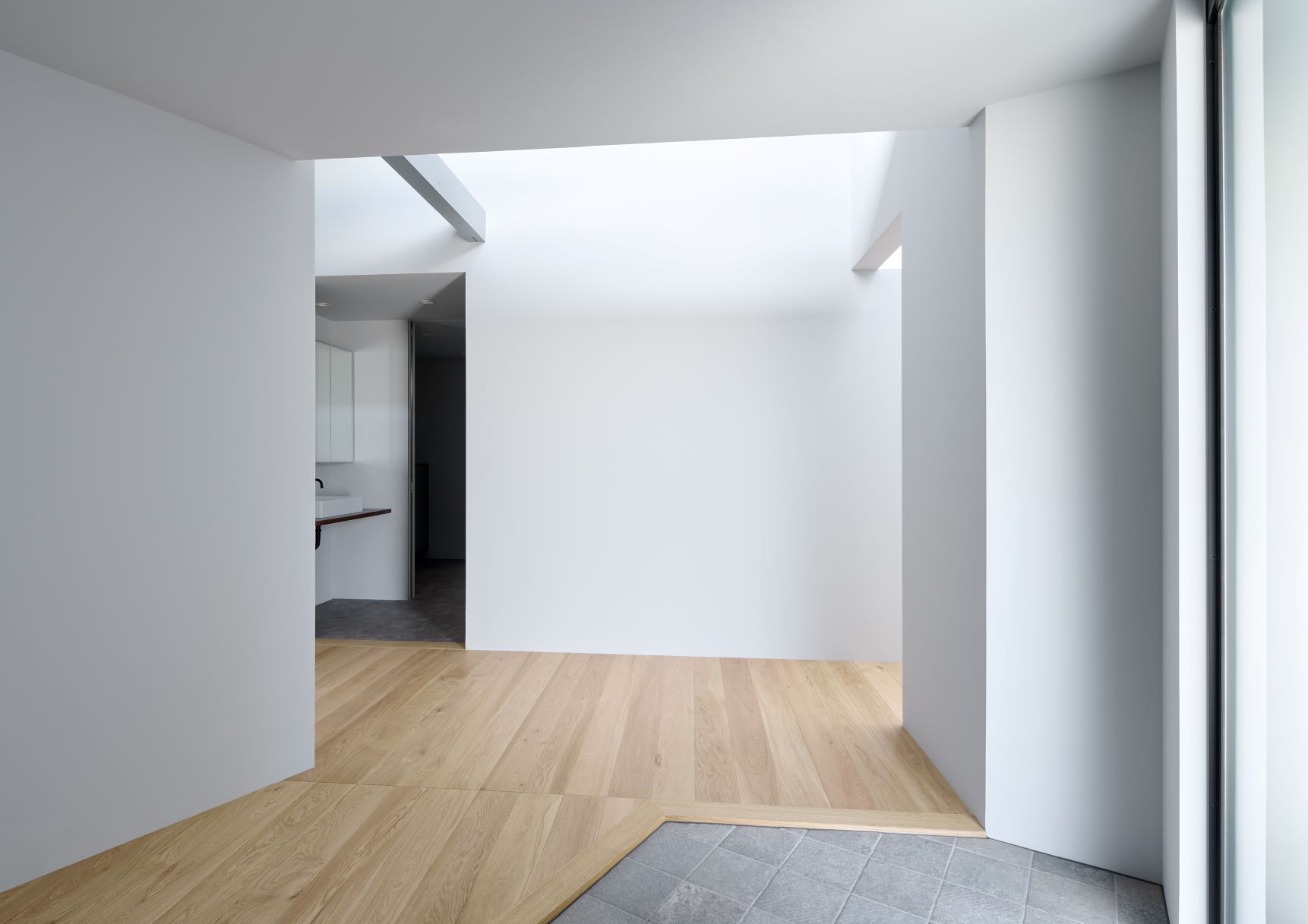
The height limits and slope further complicated the layout. The solution: a single-story section on the higher ground with a spacious, high-ceilinged living area for guests, and a two-story section on the lower ground for private spaces like bedrooms and a playroom. A corridor connecting the two housed a shared bathroom and wash area, also doubling as a covered parking space.
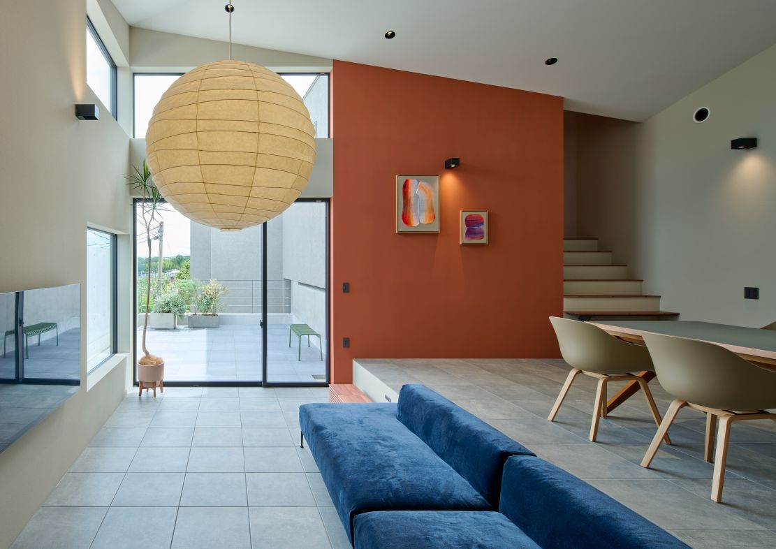
The existing gate was repurposed as a secondary entrance, while the main entrance and driveway were relocated to preserve the character of the stone wall. Inside, the living area opens with high ceilings and large windows to maximize natural light, and the open dining-kitchen space fosters gatherings.
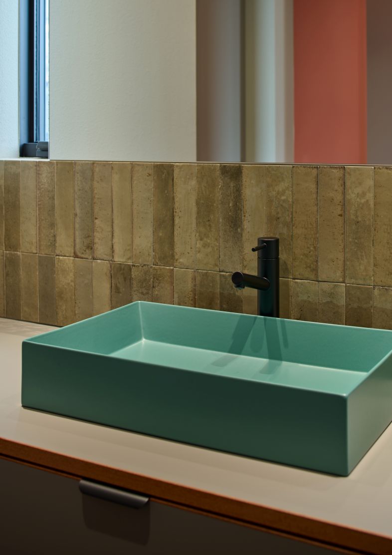
Materials such as accent walls, tiles, and engineered stone were carefully selected with the family, creating a refined, expressive interior. Designed to embrace the land’s unique features, this home blends comfort and beauty, bringing the client’s vision to life.
T様ご家族4人のための注文新築戸建住宅。この住まいの設計における最大の課題は、土地の形状と行政の規制であった。V字型の敷地は2方を道路に囲まれ、1面のみが隣家と接するという珍しい条件を持ち、さらに既存の立派な石垣擁壁に囲われた縦長の斜面地という特徴をどう活かすかが重要なポイントとなった。
加えて、風致地区および行政の規制により、第1種低層住宅地のため高さ制限があり、建ぺい率40%・容積率60%、道路側からの2mセットバックが必須、さらに屋根形状も切妻屋根・寄棟屋根・入母屋屋根の3種類に限定されるという制約があった。そのような中で、施主様のご要望は「ファサードと屋根のデザインがモダンであること」だった。 まず屋根については、厳しい規制の中でデザイン性を持たせる工夫が求められた。
切妻屋根を建物の対角に配置することで、片流れ屋根のような印象を与えるデザインを採用し、さらに庇をなくすことでシンプルかつ洗練されたフォルムを実現した。ファサードに関しては、通常であれば1面のみ意識すればよいが、この敷地では3面が道路に面するため、どの方向から見ても美しく見えるデザインが求められ、コストとのバランスを考えながらファサードを構築する必要があった。 また、高さ制限と斜面地の条件が相まって、建物の構成はより複雑なものとなった。そこで、敷地の高い部分は1階建て、低い部分は2階建てとし、建物を2棟に分けることで調整。1階建て部分には天井高を確保したリビングを配置し、来客も想定したパブリックな空間に。2階建て部分には家族の寝室や自由に使えるプレイルームを集約し、プライベートエリアとして機能させた。さらに、両棟をつなぐ渡り廊下にバスルームと洗面スペースを配置し、日常動線をスムーズにするとともに、車の屋根代わりとなる役割も持たせた。 既存の門は勝手口として活用し、車の出入りと表玄関を敷地の反対側に配置することで、趣のある石垣を壊すことなくその魅力を残した。玄関を入るとすぐに広がるリビングは、できる限り天井を高くし、大きな窓からたっぷりと自然光を取り込めるよう設計。ダイニングキッチンは家族やゲストが自然と集まれる開放的な空間とした。
また、アクセントウォールを含む壁面のカラーやタイル、人工大理石などの素材選びは、ご家族とともに細部までこだわり、表情豊かなインテリアへと仕上げた。土地の個性を活かしながら、快適で美しい住まいを実現したT様邸。施主様の想いを形にした唯一無二の住空間が完成した。
hanamari production
Flower shop
Jun 2024
Mariko / Amato Nakandakari
OVER VIEW
hanamari production, with its expansion and relocation to Kobe and Ashiya, has pursued a space that deeply embodies its unique worldview, distinct from conventional flower shops.
What they handle goes beyond the sale of flowers, including bouquets and celebratory flowers.
They also receive many requests for event decorations and large-scale installations.
Their methods of expression are diverse, ranging from hanging from ceilings to placing on walls, with each piece being created with a high level of artistry.Similar to design in architecture, a typical flower shop mainly focuses on creating “designs” based on clients’ requests, but there are limited opportunities to freely express themselves as artists.
To address this, the concept for the new design was centered around the theme of “showcasing.
”In the new atelier, an art gallery space was incorporated into the facade (front) to fully express their uniqueness. Initially, there was an idea to place the art display area in a back space,but it was decided that the large glass surface at the front should be used to allow many people to experience HANAMARI’s worldview, much like the changing window displays of brand shops throughout the seasons.
To purchase flowers, customers need to pass through the gallery space, and the flow of movement creates a fascinating feeling, as if they are walking through a show window.
The back wall of the gallery space was designed with an angled structure, resembling an open door, to naturally guide people into the atelier space.
At the far end (the center of the store), a “showcasing large counter” was installed.
Here, it’s not just a simple process but a breathtaking moment as each flower is carefully arranged and wrapped with beautifully colored wrapping paper that complements its beauty. This entire process is a captivating experience.
To allow more people to experience this beautiful moment, the counter was designed not just as a workspace but as a “showcase” that conveys both skill and attention to detail. It also functions as a workshop and production space.
They hope that their creativity and beauty will reach an even broader audience.
hanamari productionは、神戸・芦屋での拡張移転に伴い、従来のフラワーショップとは異なる、独自の世界観を深く感じられる空間を追求した。
彼らが手がけるのは、花束や祝花を含む花の販売にとどまらず、
式場装飾や大規模なインスタレーションの依頼も多く、
天井から吊るしたり、壁に掛けたりするなど、その表現方法は多岐にわたり、ひとつひとつの作品がアート性高く生み出されている。
設計デザインと同様、一般的なフラワーショップは、クライアントの要望に応じて制作する“デザイン”がメインだが、アートとしての表現を自由に行う場は限られている。
そこで、今回の設計コンセプトでは「魅せる」をテーマにした。
新たなアトリエでは、彼らの独自性を最大限に発信できるアートギャラリー空間をファサード(正面)に取り入れた。当初は、アート作品を展示する場所を裏のスペースに配置する案もあったが、正面の大きなガラス面を活かし、季節ごとに変わるブランドショップのショーウィンドウのように、HANAMARIの世界観を多くの人に感じてもらえる場所とすることが最適だと考えた。
花を購入するには、ギャラリースペースを通る必要があり、その動線はまるでショーウィンドウの中を歩いているような不思議な感覚を与える。
ギャラリースペースの背面壁は、開いた扉のように角度をつけて設計し、アトリエ空間への自然な誘導を意図した。
その奥(店舗の中心部)には、「魅せる大きなカウンター」を設置。
ここでは単なる作業工程ではなく、一本一本の花が整えられ、花に見合った美しい色の包装紙とともにラッピングが仕上げられていく。この一連の様子には息呑むものがある。
この美しい瞬間をより多くの人に体感してもらうため、カウンターは作業をする為のものではなく、技術とこだわりを伝える「魅せる場」としてデザイン。
同時にワークショップや制作スペースとしての機能も備えた。
彼らの創造性と美しさが、より多くの人々に届くことを願っている。
AKARI+LIM
Beauty salon
Date: May 2024
Owner/LIM hair
Art Direction(logo design) /desegno.ltd
Design/kfuna.ltd. Fumitaka Kawanishi
size.jpg)
OVER VIEW
In May 2024, the hair salon AKARI+LIM was born on Wukang Road, Shanghai.
The name “Akari” originates from the Japanese word for “light.” Initially, the design concept envisioned a warm, gentle glow. However, upon visiting Wukang Road, we found it to be a place infused with an energy far beyond our imagination. Young people crowded the streets, enjoying dining and shopping, while the entire city pulsed with a refined, competitive tension.
The same atmosphere was also reflected in the stylists who gathered in this space.
What we sensed here was not just a quietly flickering light, but the presence of a flame burning with intensity.
Fire continues to burn as it changes shape, eventually consuming itself.
A small light can grow into a great blaze.
Yet, it can also be easily extinguished, its endurance dictated by its environment.
However, people have the power to shape their own environments.
No matter the circumstances, one can continue burning with passion through determination and ingenuity.
Even more, one has the strength to change the environment itself.
This architecture was designed to embody that worldview.
Thus, we sought to express the process of material transformation within the space.
The undulating glass embodies a fabric-like softness.
The bench, which appears rock-like, is actually made from low-density foamed urethane.
Unlike conventional urethane, which hardens, its low density retains a degree of softness.
As people sit and place objects on it over time, its shape gradually changes.
What appears soft is actually hard,
And what seems hard is, in reality, soft—
Through such visual illusions, the design challenges perceptions of material essence.
The counter juxtaposes natural stone with artificial stone that closely resembles it.
Despite being different materials, they are placed in the same space, serving the same function.
It conveys the idea that, regardless of given conditions, one can find their own way of being—
And at times, even transform their surroundings.
It is a metaphor embedded within the design.
This space is not merely a beautifully curated salon.
It invites reflection on what it means to continue burning,
while serving as a gathering place where the “light (flame)” ignited here becomes a beacon,
fostering new encounters and connections.
2024年5月、上海・武康路にヘアサロン AKARI+LIM が誕生した。
「アカリ」という名は、日本語の「燈」に由来する。当初、設計のイメージとして抱いていたのは、温もりのある穏やかな光だった。しかし、実際に武康路を訪れると、そこは想像以上に都市の熱量を孕んだ場所だった。食事やショッピングを楽しむ若者たちがひしめき、街全体が競い合うような、研ぎ澄まされた緊張感を纏っていた。
また、この場所に集うスタイリストたちからも同じような空気感が伝わってきた。
そこに感じたのは、ただ静かに燈るあかりではなく、強く燃え上がる「炎」のような存在だった。
火は形を変えながら燃え続け、やがて自らを滅する。
小さな燈も大きな炎へと成長する。
しかし容易く消えてしまうこともあり、その持続は置かれた環境に左右される。
だが、人は環境を創り上げることができる。
どのような状況にあっても、志と創意工夫によって燃え続けること。
さらに、自らの力で環境そのものを変える強さ。
そんな世界観を、この建築で表現したいと考えた。
そこで、素材が変化していく過程を、空間の中で表現した。
波打つガラスには、布のような柔らかさを表現した。
岩のように見えるベンチで使用したのは、密度の低い発泡ウレタン。
通常のウレタンは硬くなるが、密度が低いため柔らかさが残る。
そのため、人が座ったり物を置き続けることで、徐々に形が変化していく。
柔らかそうに見えるものが実は硬く、硬そうに見えるものが実は柔らかい──
そうした視覚的な錯覚を通じて、物質の本質が問い直されるデザインとした。
カウンターには、本物の石とそれに似せた擬石を並べている。
異なる素材でありながら、同じ場所に配置され、同じ役割を与えられる。
それは、与えられた条件が何であれ、自らの在り方を見出し、
時には環境すらも変えることができる──
そんなメッセージを込めた、ひとつの寓意でもある。
この空間は、燃え続けることの意味を問いかけるとともに、ここで生まれる「燈(炎)」が人々の目印となり、さまざまな出会いやつながりを生む“集う場”となることを願っている。
size.jpg)
size.jpg)
STAKK
Beauty salon
Date: November 2022
Owner/STAKK , Masaki Yoshida
Design/kfuna Co.Ltd.Fumitaka Kawanishi
Construction/kfuna Co.Ltd. Hirokazu Terada
Shooting/Daisuke Shima
OVER VIEW
STAKK
The beauty salon by Osaka's orange street, STAKK, headed by Mr.Masaki Yoshida, is now open.
The origin of the name is from the word stack, meaning "to pile up".
Before it underwent planning, prebuilt windows in a lattice-like layout would enter the field of view when looking around the bare shop.
In that instance we linked it with something we saw in a sketch from the shop owner, Mr Yoshida.
A sketch that logically analyses a hairstyle from the shape of the head made into a grid. A lattice that was iconic of his own logical way of thinking.
From there the design concept turned into "Grid."
(Grid = a mesh of lines used as a foundation).
Firstly the floor and walls were made into a grid. (The floor tiles convey the grid).
There it's functions are introduced, and the size of interfering objects (size of mirrors and spacing of seats) is also established.
The stainless steel booths in the center of the shop contain shampoo sinks. Outside, rows of seats are placed.
On the exterior, existing products on a stainless steel board were finely segmented into a tile layout, and stacked on top of each other.
On the inner wall surface tiles of wood wool cement, cut into periodic segments from the provided size, were placed. (Also as a way to block out the noise of conversation or water)
This lines up with the name of the shop of course, but it is meant to convey the owner's logical concept of "periodic subdivision" (gridification) in the construction.
The intention and subject here was "distance".
As the owner has a strong sense of balance and object spacing, even slight disorder is very distressing.
Working with that, objects and people are placed at set distances and sizes were distributed such that the walls and floor were parallel to the seating area.
Also, so that none of objects in view drew too much attention, we wanted to create "blind spots" in the shop.
However we felt it was not wise to build walls just for that purpose, so two shampoo booths were placed in the center of the shop (angled according to movement lines) and spaced apart.
Regarding the haircut area, there are currently four seats in place, but may be expanded to a maximum of nine for the future.
Because the stainless steel comes in tiles, mirrors can be attached at the corners, making expansion easy.
In addition, a merit to having materials come in tiles is that there is no need to replace everything if a portion is damaged. You can restore it by replacing just those parts.
Considering how things could change from here on, it was designed not with the intention to fix or redo anything but to make the same materials last as long as possible, creating a functional design that's considerate to the environment.
STAKK
大阪のオレンジストリート沿いに𠮷田将希氏率いる美容室「STAKK」がOPEN。店名の由来は「積み重ね(STACK)」からである。
設計に入る前にスケルトンになった店内を見渡すと格子状の既存の窓が視界に入り、その際にオーナー𠮷田氏のスケッチで見たある物とリンクした。
それは“頭の形をグリッド(格子状・網目状)化しヘアスタイルを論理的に分析されたスケッチであり、ロジカルな考えを持つ彼自身を象徴する“格子”であった。
そこから設計コンセプトは『グリッド(Grid)』となった。
【グリッド線=基準を示し使用される網目状の線】
まず初めに床と壁をグリッド状に。(床のタイル材はグリッドを表現。)
そこに機能をあてこみ、干渉してくる物体のサイズ(鏡サイズや席間隔)も構成した。
店内中央にあるステンレスブースは、中にシャンプー台。外にはセット面を設置。
外側は、元の既製品は大きなステンレス板であったが、それをわざとタイル状に細かくカットし、全面に積み上げた。
内側壁面に(水や会話の音を遮断する目的としても)使用した木毛セメント板も既製サイズから一旦カットした物を。こちらも同じく“積み上げた”。
これは店名に重ねた事はもちろんだが、オーナーの“一旦細分化(グリッド化)してから構築する理論的な思考そのもの”を表現したのである。
ここでの要望と課題は『距離』であった。
オーナーは平衡感覚や物体との距離などに敏感であり、少しの違和感が大きなストレスとなるという。
それを踏まえ、人や物と一定の距離を保つサイズをそれぞれに割り出し、セット面に対して床と壁を平行目地に。
そして視界に入る物に気がとられすぎないよう、店内に死角を作りたかった。
しかし、それだけの為に壁を作るのはスマートでないと考え、店内中央に(動線から角度を調整した)シャンプーブースを2つ作り、これを隔たりとした。
カット面においては、現在4台が設置されているが、将来を見越し、最大9台増設が可能。
ステンレスがタイル状であるからこそ、目地に鏡の取り付けができ、増設が容易となった。
更に、資材がタイル状であるメリットとしては、一部の建築資材が傷んでしまった際には全てを交換する必要がなく、その部分だけを取り換え・修復が可能である。
今後の変化も考えた際に、作り直すのではなく、同じ素材をなるべく長い期間丈夫に使用でき、環境にも配慮された機能的なデザインとなった。
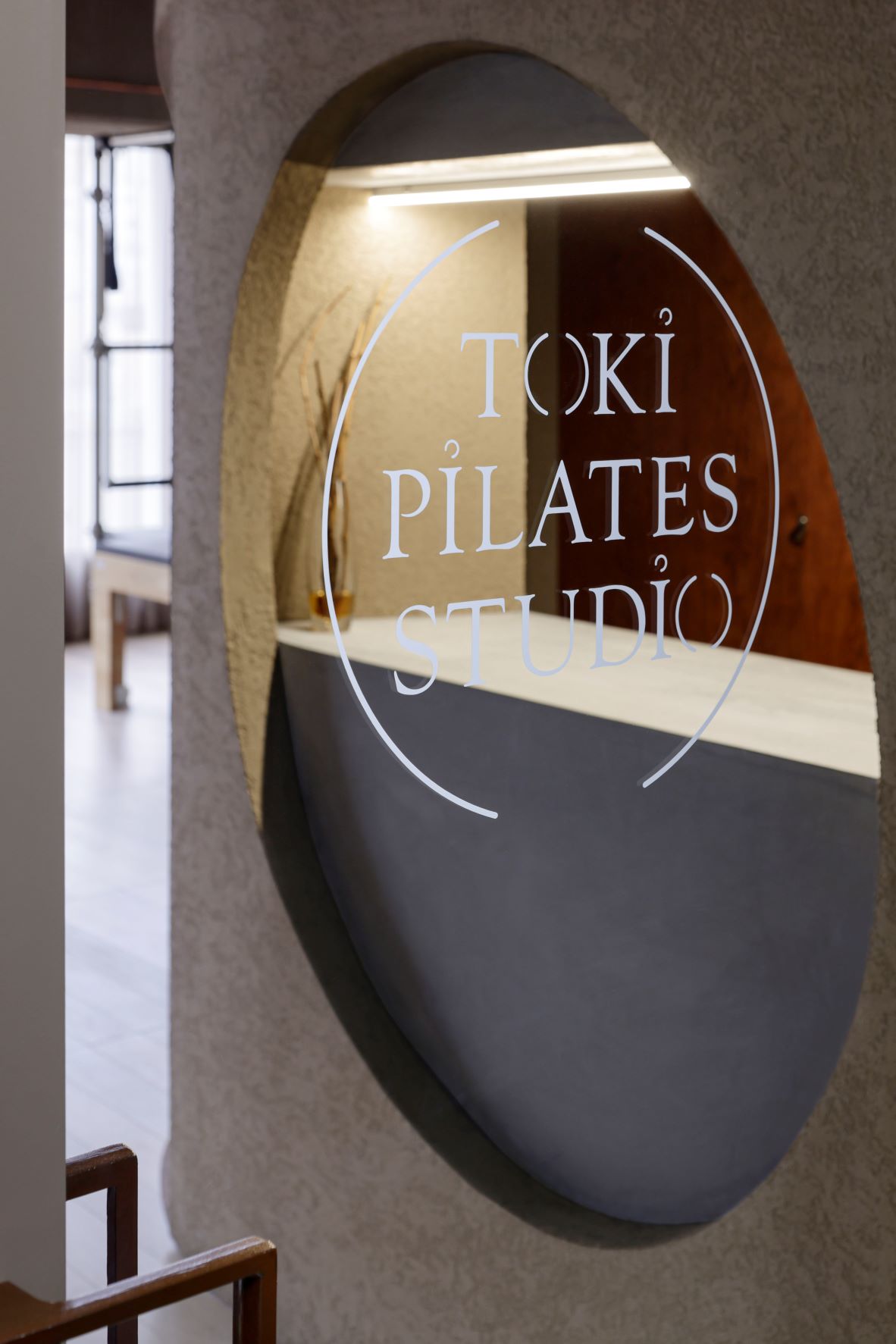
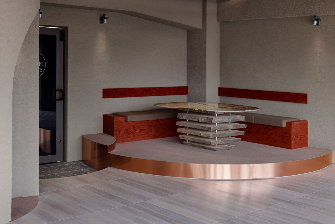
TOKI PILATES STUDIO
Pilates studio
Date: December 25.2022
Owner/Shino Ishihara
Design/kfuna Co.Ltd. Fumitaka Kawanishi
Construction/kfuna Co.Ltd. Hirokazu Terada
Shooting/Daisuke Shima
OVER VIEW
TOKI PILATES STUDIO
TOKI Pilates Studio has opened in Kobe Motomachi district in Hyogo Prefecture. In addition to regular Pilates, you can also experience prenatal and postnatal Pilates here.
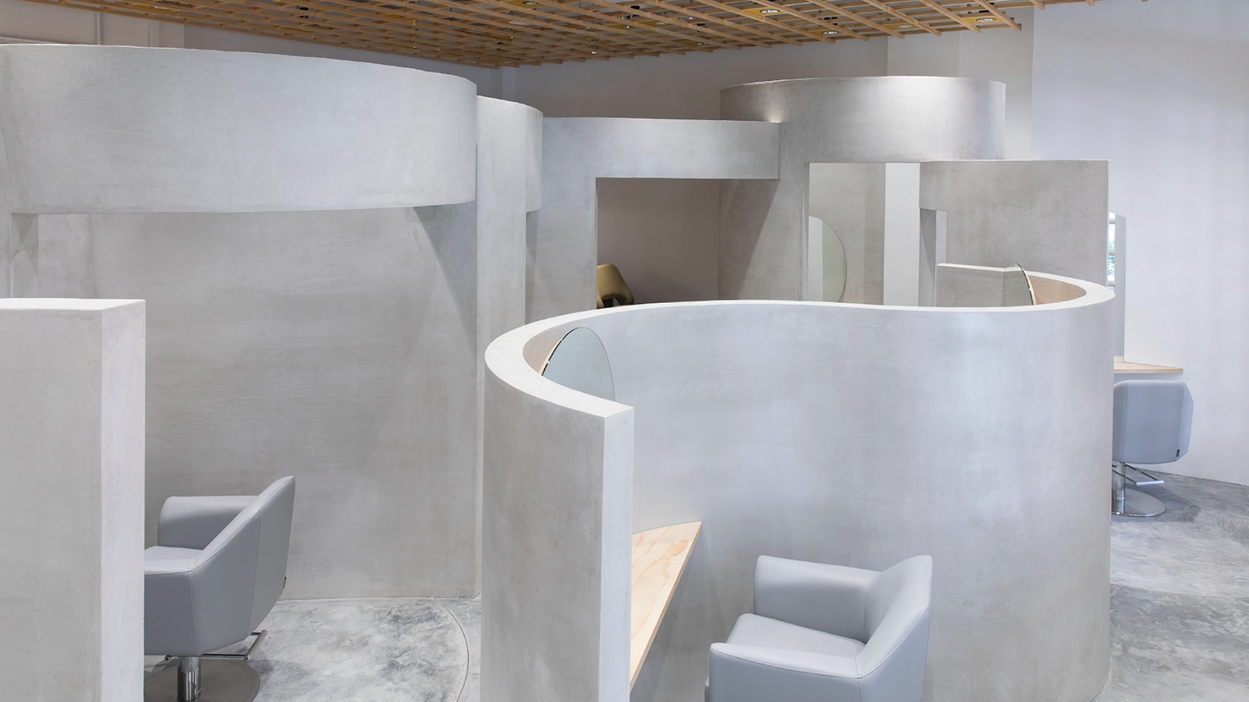
The design concept for this project is "circulation." Based on the theme that "health and beauty, body and mind, everything is interconnected and circulates" as one of the features of TOKI Pilates, the studio design incorporates this theme.
Moreover, since prenatal and postnatal Pilates are also a feature of this studio, the interior is designed to evoke the warmth and roundness of a mother's body, as well as the vitality of a cave.
The use of circles and curves on the walls, reception windows, and other elements serves this purpose.
One of the goals for this design was to avoid the typical image of a "studio" or "facility" as much as possible.
Instead of creating a bland, public space, the intention is to provide a place where visitors can naturally focus on their own body and mind, and experience a greater sense of privacy.
The approach taken here focuses on storage functionality as well.
In a studio where both the body and mind are nurtured, it is essential to have "everything in order." With this in mind, the goal was to assign a designated place for every item, provide storage spaces, and maintain a clutter-free environment as much as possible.
While Pilates studios may seem to be primarily about machines, they also utilize numerous small items and tools, such as mats and balls. To prevent these items from becoming scattered, spaces have been designed to ensure easy storage with minimal effort.
The space is designed using natural materials that have developed over time, such as earthen walls, solid wood flooring, and a natural stone table (with legs made from sliced logs). The goal was to create a comfortable yet tense atmosphere while maintaining a natural taste, allowing people to return to their true selves.
As an accent, copper plates were used to decorate the ceilings and window frames, expressing the natural shine and beauty that comes from layering.
Additionally, abundant natural light enters the studio through its continuous windows. During the day, the space is bathed in sunlight, providing a sense of openness. In the evening, a space with distinct shadows is created by using spotlights intentionally.
The natural light enhances the copper plates' beauty even further.
TOKI PILATES STUDIO
兵庫県神戸元町にOPENしたTOKIピラティススタジオ。
ここでは通常のピラティスの他、産前産後のピラティスも体験できる。
今回の設計コンセプトは『循環』。
TOKIピラティスの特徴の中で、
❝健康と美、身体と心など、全ては循環し繋がっている❞
というテーマを基に、スタジオデザインに落とし込んだ。
また、産前産後ピラティスも当スタジオの特徴であった為、
スタジオ内は母体の温かみや丸み、また生命力のある洞窟をイメージした。
壁面、受付窓等に円や曲線を施したのはこの為である。
今回「スタジオ」や「施設」というイメージをなるべく払拭させたデザインにする事もテーマの1つであった。
パブリックで淡泊な空間ではなく、ここへ訪れた人が自然と自分自身の身体と心への見つめができ、プライベート感をより感じられる場所を提供したいという考えからである。
ここでの取り組みは機能面として収納にも注力。
体も心も整えるこのスタジオではやはり「全てが整えられていてこそ」なのではないかという思いがあり、全ての物の住所を決め、収納場所を設け見渡してもなるべく無駄な物が見えずスッキリとした状態にしたかった。
ピラティススタジオはマシーンがメインのように見えるが、マットやボールをはじめ様々な小物や道具が多い。
これらの道具が散乱しないよう、極力少ないアクションで収納可能なスペースを確保した。
土壁、無垢フローリング、天然石のテーブル(脚は丸太の木材をそのままスライス加工)など、年月をかけて自然が生み出した素材でまとめ、心地よい緊張感がある空間でありながらも ありのままの姿に戻れるようなナチュラルなテイストにした。
そして、そこへアクセントとして銅板を天井や窓枠へ装飾。
積み重ねの中に表れる自然な輝き、美しさを表現した。
又、ここの連窓の窓からは自然光が大きく入る。
時間帯によっても表情が変わるこのスタジオで
日中は自然の光を浴び、解放感を。
夜間は陰影を感じられる空間にする為、
あえてスポット照明を使用する事とした。
この効果で自然光が銅板も更に美しく輝かした。
PELE NAGOYA
Beauty salon
Date: December 2022
Owner/PELE RYUSEI ,Kohta Hirano
Design/kfuna Co.Ltd.Fumitaka Kawanishi
Construction/kfuna Co.Ltd. Hirokazu Terada
Shooting/Daisuke Shima
OVER VIEW
PELE, a beauty salon in Shibuya, Tokyo, opened PELE NAGOYA in Nagoya in December 2022.
The design concept is "pierce, shoot through, run through."
During our discussion with clients, the words
"speed, dynamism, the times" directly resonated with us and left a strong impression.
From these components:
◯thrust into the essence, pierce people's hearts
◯ shoot through the times
◯ run through with the things you want to do and the things you should do.
We applied this to the design in a simple way.
We made the marble counter immediately beyond the entrance into stainless steel.
Also, we purposely didn't clear up the ceiling of the shampoo space and made it a "pierced" design.
"Consciously break through unconsciously created impossible walls, and make them possible," and "Don't adhere to common sense" are messages we put in here.
Also, these are surfaces overlapping.
Leaping past the level of two dots connecting into a line, we expressed the physical form of "speed," with surface and surface already connecting.
N House
Newly built single-family (order) house
March 2021
Design / kfuna Co.ltd.Fumitaka Kawanishi
Construction / kfuna Co.ltd.
Shooting / Yasutake Kondo
OVER VIEW
A House for Mx. N
A new custom-built house for two families (four family members) with barrier-free first floor
The client requested a house that would be stress-free for both the caregiver and the care receiver in the future when a family member would need to live in a wheelchair.
For example, we designed washrooms, bathrooms, and corridors to be wide enough for a wheelchair. In addition, we created enough space to provide nursing care and made the washbasin height usable while sitting in a wheelchair.
0f course, privacy, and other values vary from family to family.
Therefore, we made designs considering the movement of each person in a day throughout the house in deciding the locations of each room, bathroom, and washroom.
Our challenges were
- Making the house barrier-free
- Making a house for two households
- Dealing with all four sides of the land facing other buildings
We focused on bringing in light from the windows regardless of the neighboring houses.
We designed the building shape while taking the maximum size from the land boundary and distributed functions and rooms, considering the best combination of blocks.
We received a request that the living room should have as much natural light as possible as family members gather there. The client also did not wish to install curtains and wanted to keep the window open.
For these purposes, we carefully considered the angle of the roof to allow sunlight into the house and the position of the windows.
The living room had to inevitably be a 6-meter high atrium considering the neighboring houses' visual impact.
The 1.65m square multiple windows only showed the sky, so no curtains were needed, and the living room could have an open and wide feeling.
(High windows were also installed in each room)
We also made the built-in garage with storage functions spacious for the client because the client had many hobbies.
N様邸
注文新築戸建 二世帯(1階バリアフリー)住宅。4人ご家族。
将来的なご家族の介護を視野に入れ、車椅子の生活において介護する側もされる側もストレスが少ない住宅が施主様のご要望であった。
例えば、洗面所やバスルーム、通路等で車イスの幅を確保する事はもちろん、介護ができる十分なスペースや車椅子のまま洗面ができる高さ等を確保。
もちろんプライバシー等の価値観もご家族によって異なる為まずは動線、そして各部屋や水回りの位置に関してもお1人お1人の1日の動きを確認しながら設計へと進めた。
課題は、
〇バリアフリー
〇二世帯住宅
〇土地を囲む4面が建物に面している事
であった。いかに隣家を気にせず、窓から光を取り入れる事ができるかに重きを置いた。
建物の形は敷地境界から極力最大数を汲み取り、各機能・各部屋をブロックの組み合わせと考え、敷地面積に振り分けた。
家族が集まるリビングは極力自然光で過ごされたい事や、窓はカーテン等を設置せず開けたままの状態がご希望という事もあり、陽の入る屋根の角度、窓の位置等を工夫した。
隣家の視覚等を考慮すると必然的にリビングは6mの吹き抜け空間となった。
1.65m角の連窓からは空だけが見え、カーテンを取り付ける必要がない開放的なリビングに。
(その他各部屋も高窓とした。)
又、多趣味な施主様の為、倉庫機能を兼ねたビルトインガレージのスペースを十分にとった。
LECO odd
Beauty salon
Date: March 1.2022
Owner/LECO Soichiro Uchida
Design/kfuna Co.Ltd.Fumitaka Kawanishi
Construction/kfuna Co.Ltd.
Shooting/Daisuke Shima
OVER VIEW
LECO TOKYO is a hair salon that represents Japan in recent years, run by Soichiro Uchida. The fourth hair salon “LECO Odd” opened in Harajuku (Tokyo) in March 2022. The meaning of the store’s name “odd” is intended to convey meanings of strangeness or peculiarity.
From here, I arrived at the question of what constitutes that of "strange?” Where is the line with what is considered common sense and ordinary? Is it normal for the majority? Is "correctness" decided by someone who is really correct? I wanted to express that message through the store’s design. For example, if only one Japanese person with black hair is mixed in with 100 people who have blond hair, it may be considered “strange.” However, the opposite is also true. “Ordinary” is always next to “odd.” What is the basis for "strange"? Everything, including this mirror and furniture, was tilted 7 degrees. Looking at one piece, it may be "strange.”
However, there are some things in the store which are not slanted. If you look at everything, things that are not slanted become "strange.” What are usual standards? From what moment does discrimination and prejudice in this world occur? I wanted to express such a message with irony. The film, which has different colors depending on the viewing angle, also symbolized this.
The movable mirror is of course not only functional for when you want to use a lot of space other than salon work, so I was conscious of "flexibility" in line with the concept. Below are the themes in sdgs NO.5 Gender equality NO.10 Reduced inequality NO.16 Peaceful justice and a powerful syste And if you add an “s” to the word “odd,” it becomes “odds,” which means possibility and prospect. Even if someone thinks it is strange, I believe that if you keep doing something, it is sure to move someone in the world. Please take a look at this space and I hope that you can feel something that overturns fixed notions.

SCREEN
Beauty salon
Date:October1.2021
Owner/SCREEN Co.Ltd. Tsubasa Kamitani
Design/kfuna Co.Ltd.Fumitaka Kawanishi
Construction/kfuna Co.Ltd.
Shooting/Takumi Ota
OVER VIEW
design concept
"Connect"
What you do now and in front of you will connect you to your future self and will also have a great impact on someone.
The mirrors here are designed to "connect" with the mirrors next to each other on the left and right.
tükör+LIM
Nail & Eyelash salon
Date: september1. 2016
Owner / Less Is More Co. Ltd.
Design / kfuna Co. Ltd. Fumitaka Kawanishi
Construction / kfuna Co. Ltd.
Graphic design / Haruhiko Taniuchi
OVER VIEW
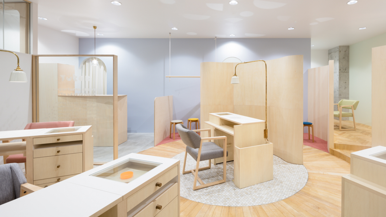
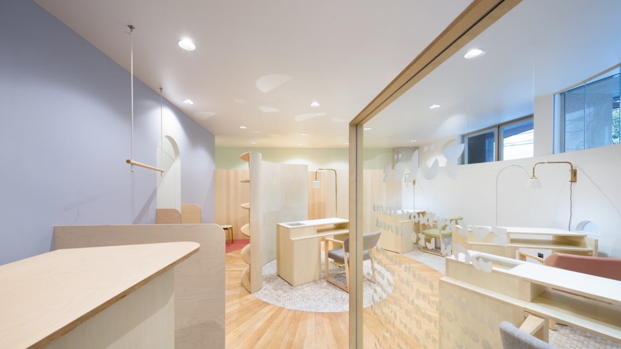
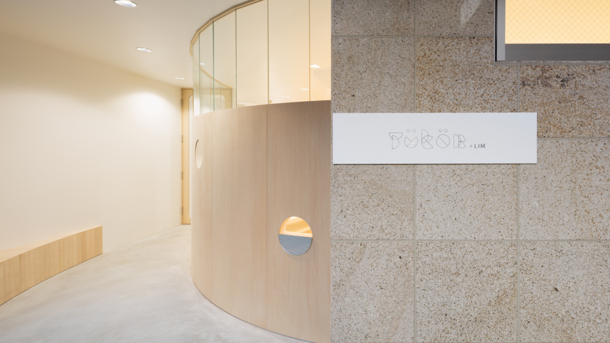
"tokur+LIM " is a nail and eyelash salon that opened in 2016 in Fukuoka prefecture, and is the first salon of LIM in Kyushu. With a unique worldview that attracted massive support, the first nail and eyelash salon of LIM was born in Kyushu (Daimyo, Fukuoka). Its theme of a "secret base" brings out the "beautiful and delicate world made by hand" of the L I M brand, and the "softness of every fine detail" for the customer's nails and eyelashes is translated into the salon's architecture design and reflected in its architectural details (e.g., shapes, raw materials, etc.). tokur+LIM embodies the salon's desire to become a place that reflects "the 'self' you want to become, the 'self' unknown to you." This is inextricable from its theme of a "secret base," and captures the excitement that makes you want to peek into its world. The arc-shaped wall that forms the entrance creates an image of the visitor being pulled into the salon's interior. Small windows and mirrors spread across the wall give form to the "curiosity that makes you want to see more" before you enter, and bestow a "sense of security of not being seen even if it feels like it" after you leave. In terms of functionality, emphasis was placed on the special characteristics of the salon such that its arrangement and operational flow ensure that customers can relax without worrying about their lines of sight intersecting with one another in the salon's waiting area, treatment rooms, make-up area, etc. To achieve that, a regular direction of flow from start to finish was established, and passageways that maximize the effective use of floor area were set up in the salon to maintain this comfortable operational flow. -The edging technique- The initial plan was to decorate the glass using cutting sheets, but after consultation with Haruhiko Taniuchi, who was in charge of the logo design this time, it was decided that "since this logo will be formed by putting individual parts together, the aim is not to have a flat surface but to create a three-dimensional impression with overlapping parts." A special technique called edging which can corrode glass and create individual hand-crafted patterns was used to accomplish this. With this technique, it was possible to achieve the desired depth to bring the logo to life faithfully, and simultaneously create the elegant worldview of the salon.
Niii by CARTA
Beauty salon
Date: March1. 2019
Owner / GK carta Tomoyuki Hara
Design / kfuna Co. Ltd. Fumitaka Kawanishi
Construction / kfuna Co. Ltd.
Photo by Toshifumi Kobayashi
OVER VIEW
Niii, a salon that opened in Dojima, Osaka's office district. What is this Niii? It represents "for ~" ("~ no tame ni" in Japanese), such as "for tools (dogu ni)" and "for people (hito ni)," as well as a smile (the onomatopoeia for which is "niii" in Japanese). The client's request was "an open space." As the arrangement pattern was limited to incorporate as much natural light as possible, we started working on the arrangement of equipment and line of flow for the design while considering the light. While the large window in the front faces north, it, fortunately, reflects the glass of the opposite building, incorporating gentle natural light. We made use of that and put up mirror film on one part to disperse light in the store as well as create depth and space at the same time. For the shampoo area, to promote relaxation, there was an idea for "an enclosed room that makes it hard to be seen by other customers while being served." However, we left only a waist-high partition wall so that the light to the entrance would not be obstructed, and the space at the top was folded into a line to let light through. Furthermore, the ceiling is low and made so that, when lying horizontally, just one's face would be a little dark. By moving the walls and ceiling to be perpendicular, we created a minimalistic finish. And by using undulating wood as the material for the waist-high partition wall, faint shadows are produced as a result of the sun rays. In this way, we created a harmonious salon with a simple and cool space through the use of gentle light, as well as warm and beautiful materials.
大阪のオフィス街、堂島にオープンした美容室Niii「ニーィ」。 このNiii「ニーィ」とは 「道具に」「人に」など、「〜の為に」という意味と、笑顔(ニーィ)を表している。クライアントからの要望は「開放的な空間」であった。なるべく自然光を取り込む為には配置パターンが限られていることから、設計デザインは光に配慮した機器の配置と、動線から着手することになった。 正面の大きな窓は北側に面していながらも、幸いに向かいのビルのガラスに反射し、ゆるやかな自然光を取り込んでいた。 それを利用し、一部にミラーフィルムを貼ることで光を店内に拡散させると同時に奥行きに広がりをみせた。 シャンプーエリアではリラックスができるよう、〝施術中の姿が他のお客様の視界に入りづらい囲われた部屋に〟という考えがあった。 だが、入り口への光を箱で遮らない為にも腰壁のみを残し、上部の空間は光を通すラインに折り畳んだ。 更に天井は低く、態勢が横になった際にはフェイス部分だけが少し暗くなるようになっている。 壁と天井を水平垂直に動かす事でミニマムに仕上げた。 そして腰壁には波打つ木の素材を使用することで日の差し込み方により微かな陰影が映し出された。 このようにシンプルでクールな空間の中に、ゆるやかな光と暖かみある美しい素材で調和をとったサロンとなった。
TOKI+LIM
Beauty salon
Semtember1. 2019
Owner / Less Is More Co. Ltd.
Design / kfuna Co. Ltd. Fumitaka Kawanishi
Construction / kfuna Co. Ltd.
Graphic design / Haruhiko Taniuchi
OVER VIEW
【Peaceful coexistence】
This beauty salon is located at Singapore's famous hotel, Raffles Hotel. The characters in the name TOKI (日月) + LIM are “sun” and “moon.” In Japanese, “toki” means “time.”
Their desired order was “to allow the beautician and the customer to spend a relaxing time in a one-on-one space” and “to have a high-quality atmosphere that does not impair the atmosphere of the Raffles Hotel.”
I wanted to express "quality" philosophically. I thought that true quality was not something inherently gorgeous or visually beautiful alone, but something rich in the human mind.As a concrete design, I decided to create a semi-private room space. The first reason was to get to an intimate, one-to-one space. The other reason was that I wanted to compare this architecture to something greater.In designing this store, I always wanted to link to Singapore's social background. Compared to Japan, it is quite different on an overall societal level.Singapore is a prosperous trading country with a unique social background and wonderful culture that embraces multiple races. In Japan, we tend to have a far more homogeneous or uniform image around ourselves.
As I walked around the city, I could see that cultures and religions of all races were mixed and coexisted. There seemed to be a respect for and acceptance of other cultures rather than exclusion.As a Japanese, I was impressed by this and felt that it represented “richness” and a symbol of “quality.”
There are no completely private rooms in TOKI + LIM, and some are open because I wanted to express a feeling of mixing. Each tower is not isolated and coexists while maintaining a reasonable distance.
The heights are different, but the materials are all made of the same concrete. Although it differs slightly from the surroundings, it is an expression that the values of the contents are all equal and that everything is a precious thing which should be respected.Rather than interpreting the mixture of cultures in Singapore as a mere historical background, the message is "Coexistence is peaceful.”By incorporating this into the design of TOKI + LIM, which was set up as a store in a historic hotel, it was not just a design of a beauty salon, but also a symbol of peace.
【平和共存】
この美容室は、シンガポールの有名ホテル、ラッフルズホテル内にオープン。
TOKI(日月)+ LIMという名前の文字は、「太陽」と「月」を意。
日本語では、「トキ」は「時間」を意味する。
空間イメージとしては「お客様がくつろげる個室」、「ラッフルズホテルが持つ上質な雰囲気」
を目指した。そして「上質」を哲学的に建築で表現したいと考えた。
(真のクオリティとは、本来ゴージャスな物ではなく、人間の心に豊かなものではないかと考えた。)
具体的なデザインとして、セミプライベートの部屋空間を作ることに。
この店舗をデザインするにあたり、シンガポールの社会的背景にリンクしたかった。日本と比べると、社会全体が大きく異なると感じた為である。シンガポールは、独特の社会的背景を持ちつつ、複数の人種をや他の文化を尊重し、“排除”ではなく、“受け入れている”事で、人種、文化、宗教が入り混ざり合って共存しているように見えた。それこそが「豊かさ」や「品」の象徴だと感じたのである。TOKI + LIMには完全な個室はなく、ミックス感を表現したかったのでオープンしているところも。
各タワーは孤立しておらず、適度な距離を保ちながら共存。
高さは違うが、素材はすべて同じコンクリートでできている。周囲とは少し異なりますが、内容の価値はすべて同じであり、すべてが尊重されるべき貴重なものであるという表現である。シンガポールの文化の混合を単なる歴史的背景として解釈するのではなく、「共存=平和」というメッセージである。これを歴史あるホテルの店舗として立ち上げたTOKI + LIMのデザインに取り入れることで、サロンデザインとしてだけでなく、平和の象徴とした。
CODE+LIM
Beauty salon
March 10. 2018
Owner / Less Is More Co. Ltd.
Design / kfuna Co. Ltd. Fumitaka Kawanishi
Construction / kfuna Co. Ltd.
Graphic design / Haruhiko Taniuchi
Shooting / Daisuke Shima
.jpg)
OVER VIEW
CODE+L I M has become an iconic hair salon in Harajuku in recent years. The salon was forced to increase its number of seats due to the rising number of customers, and it re-opened in 2018 after renovations. The theme of the revamped salon is "from an unknown CODE to a vocal CODE." The salon's logo was designed by HARUHIKO TANIUCHI. Design of the logo was based on the Morse code of code. In addition to enhancing its services as a hair salon, the salon has gone beyond its conventional role to re-invent itself as a venue that hosts artists and events so as to share all kinds of art with others. As it has been conceptualized as a place that can be adapted for various functions including hair shows, art events, and as a photography studio, the salon had to be equipped with movable fixtures. The concept behind its design is "chemical reaction." "How is art born?" Is it when you are inspired by something? "Something born in the aftermath of a collision between different materials" Art is believed to be similar to a chemical reaction that happens in one's mind. You can think of the shampoo racks, perming corner, staff room, and reception desk as individual elements that are allowed to collide into one another to give rise to this artistic space. This represents the idea of a chemical reaction. Another purpose of this design is to ensure that the increase in the number of seats does not negatively impact the service flow or available space in the salon. The different elements have been made as compact as possible in the limited area of the salon, and the problem was resolved by allowing them to "collide."
.jpg)
.jpg)
.jpg)
waxingsalon TOOL
Wax salon
April 25. 2016
Owner / Noriko Suzuki
Design / kfuna Co. Ltd. Fumitaka Kawanishi
Construction / kfuna Co. Ltd.
.jpg)
OVER VIEW
Warp into a New You A waxing salon of only 4 tsubo (roughly 13 square meters) in Minami Semba, Osaka. As soon as you enter, you will see a corridor, which is rare for narrow properties. In addition to separating the reception desk and the waxing room, avoid the gaze of people waiting their turn, and allowing clients to enjoy their excitement as they wait for their wax, the number 1 reason is to visualize a boundary that will warp you into a new world. This corridor, which is like a wooden box, is long on the left side and short on the right side. As a result, the entire box looks off-kilter. This was done purposefully to accentuate the theme of warping and allow the corridor to settle in with the partitions. Finally, we created a comfortable distortion by spacing the wood for the walls of the corridor evenly in order to add regularity to the distortion. Also, a restroom is hidden somewhere in this corridor. In this space that is not spacious, people do not want to be seen entering and exiting a restroom from up close, and we did not want the restroom to stand out in a salon that requires cleanliness, so we created a trap door, which can also be enjoyed by customers. The waxing room requires partitions, because it is a private space. Even though solid walls are needed, this property does not have large buildings nearby and has excellent sunlight and ventilation that would make blocking the windows a waste. Using only a transparent curtain to take advantage of this caused concern about the line of sight from outside. Therefore, we used perforated metal together with a curtain to block the line of sight, while allowing light and ventilation to enter the waxing room. Further, we curved the perforated metal to inject delicateness and softness within the strength of the metal.
.jpg)
ONE&ONLY
Beauty salon
June 1. 2020
Owner / Kazuma Okamoto
Design / kfuna Co. Ltd. Fumitaka Kawanishi
Construction / kfuna Co. Ltd.
Shooting / Takumi Ota
.jpg)
OVER VIEW
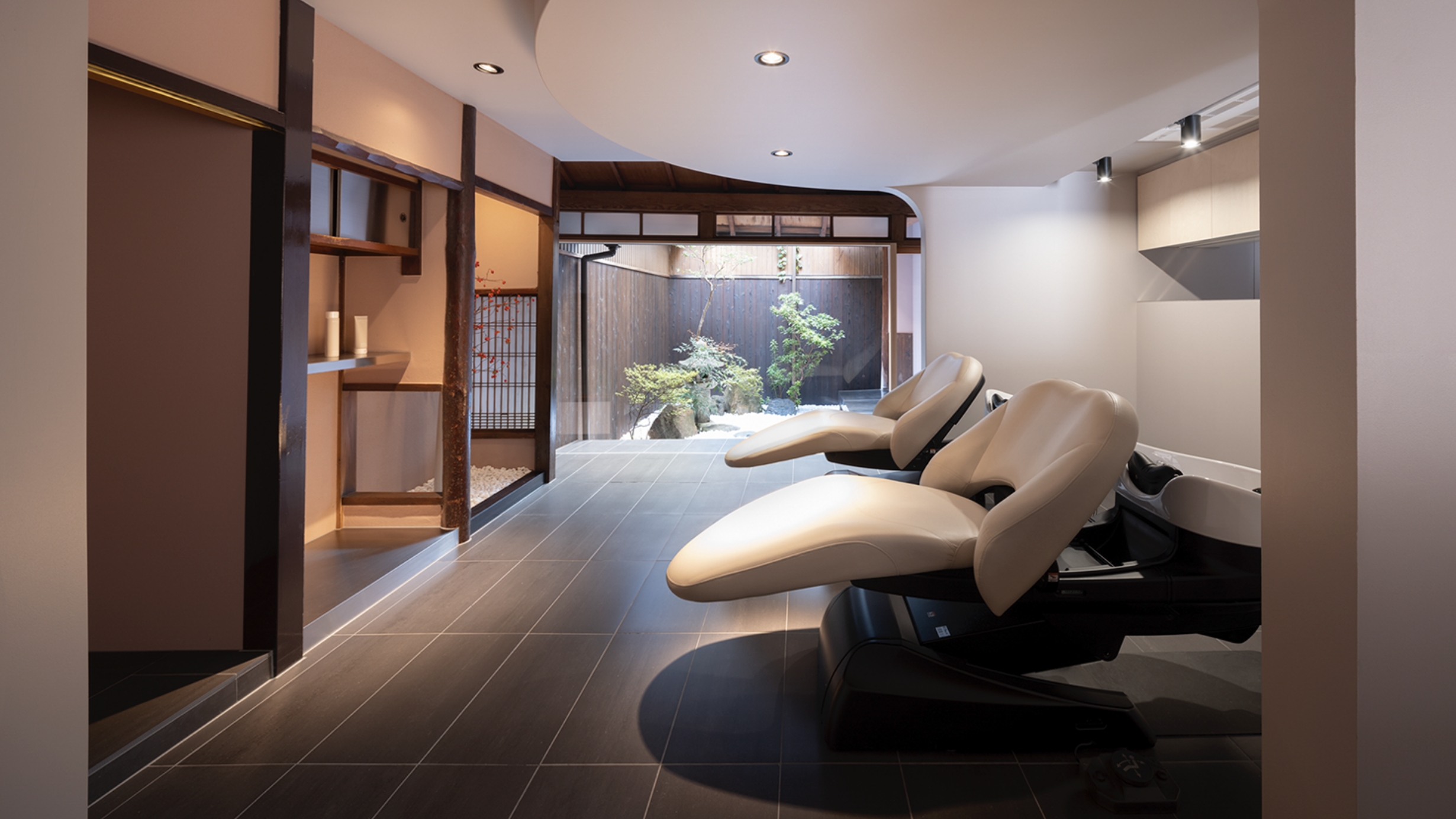
Beauty salon “ONE&ONLY” is in a renovated, traditional machiya in Kyoto, which opened in June 2020.
This old, traditional Japanese machiya townhouse needed repairs. The owner wanted to continue blending in with Kyoto's traditional townscape, but to also update the space with new elements.
The goal was to create a "modest and elegant salon." By having traditional elements and blending in with the neighborhood, the beauty salon aims to be a place where people can relax.
The traditional architecture and the small courtyard garden had to be retained. But the garden was far away from the entrance, so visitors would never see it.
Since Kyoto machiya townhouses typically have a narrow facade and a long building length, the courtyard garden was supposedly built because sunlight and wind otherwise would not enter from the far end of the building.
As shown here, modifications have been done to allow more visibility. The traditional elements incorporated by previous generations were retained. A large round window was cut out of the outer wall, and the interior partition was changed to glass.
Since the round window also has a lattice, it blends in with the Kyoto townscape. The large pattern makes it easier for people to see through it from the outside. At night, the opposite happens with the machiya giving light instead of receiving it.
The wall is made of clay that can breathe and help adjust to the humidity. It has been painted a pinkish color to give a warm impression.
Only customers can see the entire courtyard garden that is partially visible from the front of the building.
Since the wooden deck (engawa) fronting the courtyard garden was deteriorating, it was replaced with durable tiles and stainless steel for better design and durability in outdoor weather.
As a result, the external light reflecting off the deck makes the salon interior brighter and more beautiful.
To suit modern times, consideration for the environment was also made. Electricity is conserved by using more natural light coming through the large round window and from the courtyard garden. The use of more durable materials also helps to reduce waste.
Modern elements have been added to the traditional by using materials, colors, and shapes which were hardly used in Japan when the machiya was first built. This has created a pleasant disharmony and an enjoyable space incorporating the natural beauty of the changing seasons.
美容室「ONE&ONLY」は、京都の伝統的な町家を改修し2020年6月にオープン。
この日本伝統の町家は築年数が古く、修繕が必要であった。
また、京都の伝統的な街並みに溶け込むだけでなく、同時に新しさを感じられる空間を。とのご依頼。そこで「奥ゆかしさ」を感じることができる美容室をコンセプトに、伝統的であり、京都の街並みに溶け込み、現代の人々がリラックスできる場所を目指した。
残すべきこの町屋の魅力は伝統的な造りと坪庭であったが、この坪庭は入口から1番離れた場所にある為、来訪者は誰もが目にする事ができなかった。(京町家は、ファサードが狭く、建物の長さが長いため、建物の遠端から日光や風が入らないため、中庭が建てられたと考えられる)このように“先人の工夫”が込められた、美しい伝統を多くの方に見てもらえるよう、外壁の一部をくりぬき大きな丸い窓とし、店内の間仕切り素材を1枚のガラスに変更する事で、外から一番奥の坪庭までが見えるようにした。
また、この丸い窓には京都の景観に馴染む“格子”を取り付けた。通常よりも格子のピッチを広げる事で外からも見えやすい窓格子とした。日中は季節によって店内に陽や影も差し込み、自然を感じる事ができ、夜になると、光を与えることが可能に。壁素材は呼吸し湿度を調整する土壁を使用。この土壁は暖かい雰囲気を表現できるようピンクに近い色とした。坪庭の縁側は木が使用されていたが、腐食が進んでいた為、耐久性とデザイン性を加味し、素材を長寿命のタイルとステンレスに変更。その影響で外からの光が反射し、店内をより美しく映し出した。大きな正円窓や中庭から差し込む自然光を利用することでの節電や、より耐久性のある素材を使用することで、廃棄物の削減を目指し、環境にも配慮。
町家が誕生した当時、日本ではほとんど使われていなかった素材や色、形を使い、伝統建築に現代的な要素を加えた。季節の移り変わりの自然の美しさを取り入れた、心地よい不調和を楽しんでもらいたい。
.jpg)
.jpg)
.jpg)
.jpg)
.jpg)
.jpg)
JAM
Beauty salon
July 1. 2020
Owner / storage green label Co. Ltd. Taku Nagasaki
Design / kfuna Co. Ltd. Fumitaka Kawanishi
Construction / kfuna Co. Ltd.
Shooting / Takumi Ota
.jpg)
OVER VIEW
Share Salon JAM is a beauty salon located in Osaka.
In recent years, the demand for shared salon spaces is gradually increasing in Japan as well. The impacts of the COVID-19 pandemic on employment are one of the reasons for this.Due to factors such as shortened operating hours, increasing numbers of workers see the appeal of working freelance. In response to this changing environment, Share Salon JAM was completed in 2020 as a space enabling salon staff to work whenever and for as long as they want.
The design concept is around “jam.” This word expresses the meaning of different people working alongside each other.
Instead of borrowing a salon name and working as employees, this facility allows each worker to express their own unique individuality, We express this concept as “intermixing individuality.”
First, the color of the front glowing wall varies depending on the angle. It shows the individuality of human beings and different perspectives.
Each person's individuality is like a material (box). In addition to tiles and paint, the materials for the private rooms normally used for the base were also employed.
By giving a flat value to these materials that are usually covered over immediately, the design achieves an expression of individuality free from any hierarchy of superiority and inferiority, which I think is a beautiful thing.
Also, the shape of these boxes are not perfectly aligned, but instead allowed to overlap with other neighboring rooms. This gives the space a sense of varied movement.
Although this expresses the forms of free individuality (materials) in a lively motion and through helping each other, the shape was not created by chance.This design was essential for allocating functional lines of movement to maximize utilization of the space.
There are three types of rooms to choose from. There are private rooms, semi-private rooms, and open space available.
For these rooms, the shampoo stations are shared with the open space, so ensuring that the usage timing for these stations didn’t overlap was one issue to consider.
As a means of reducing customer contact and achieving smooth movement, customers’ shoes alone are visible from the hall during shampooing. Stylists can also immediately tell whether each station is in use or not.
From the perspective of social distancing as well, this approach provides maximum function with minimum space.
シェアサロン(美容室)JAMは大阪、天王寺にある。
近年、日本でもシェアサロンスペースの需要が徐々に高まっており、COVID-19パンデミックが雇用に与えた影響がこの理由の1つである。営業時間の短縮などにより、フリーランスで働く魅力を感じる労働者が増えた。このような環境の変化に対応し、2020年に美容師がいつでも好きなだけ仕事ができるスペースとしてシェアサロンJAMが完成した。設計コンセプトは「JAM」。
JAMという名前には異質なもの同士が混在するという意味も含まれている。サロン名を借りて社員として働くのではなく、社員一人ひとりが個性を表現できる施設であり、「混ざり合う個性」というコンセプトを設計で表現をした。
まず、正面の光る壁の色は角度によって異なる。これは人間の個性と異なる視点を示した。そして、人が持つありのままの個性をそれぞれの素材(箱)に見立てた。個室の素材はタイルや塗装に加え、通常下地に使用されるmdf(中密度繊維板)、木毛セメント板、木材(下地木材)もそのまま使用通常はすぐにカバーされるこれらの素材にフラットな価値を与えることで、優劣や階層のない個性を表現したデザインは美しいと考えた。
また、土台にあたる部分は要素を最大限に削ぎ落とし、それぞれの素材を引き立たせるために躯体のままに。
空間の箱はきれいに整列されておらず、箱同士の一部が隣と重なり合うなど、色々な向きに動いているように見える。これは自由に個性(素材)が躍動している姿や、助け合う姿を表現しているものの、この形は偶然生まれたものではない。
最大限活用できる空間と機能的な動線を割り当てると必然的にこのような形になったのである。(施術の際に必要となるであろう直径2メートル以上のスペースを確保した。)ここでは選ぶ事が可能な空間を大きく3種類に分けた。
個室、半個室、オープンスペースである。半個室、オープンスペースの席ともシャンプー台は共有するが、共有シャンプースペースは使用するタイミングが重ならないようにする事が課題であった。スムーズな誘導が可能となり、お客様との対面時間を減らす方法としてシャンプー中は廊下側からお客様の靴だけが見えるようにした。美容師は廊下からシャンプー台の方向を見るだけで使用中か否かを瞬時に把握する事ができる。ソーシャルディスタンスなどの観点からも、この工夫は最小限のスペースでの最大限の機能となった。社会的距離の観点からも、このアプローチは多くの価値を提供した。
.jpg)
.jpg)
.jpg)
yuo virth+LIM
Nail & eyelash salon
June1. 2018
Owner / Less Is More Co. Ltd.
Design / kfuna Co. Ltd. Fumitaka Kawanishi
Construction / kfuna Co. Ltd.
Graphic design / Haruhiko Taniuchi
Shooting / Daisuke Shima
.jpg)
OVER VIEW
you virth +LIM, opening in Daikanyama, is the sister store of virth in Minamiaoyama. The large windows of the second floor overlooking Yaesu-dori in Daikanyama display the store's icon, much the same as its sister store. Its theme is "virth of the night." This space was appealing for its open atmosphere. We wanted to put the light and scenery from the windows and its width to use. Normally, if we made an eyelash space inside, we would have to make a squared off space, which would take away from the scenery and width. To solve this, we changed the angle of the store and made it on a slant. We avoided making a space squared off by four walls where possible. By making a large slanted wall that stretches to the waiting area instead of a boxed off room, we were able to casually create a divide, while at the same time ensure sufficient space for each space. The slanted divider allows light from the windows inside, puts the width of the space to use, and maintains the open feel while still providing some separation of the space. The waiting area and eyelash space are separate, which, despite having no doors, allows users to have some privacy. We also adjusted the positions of the eyelash bed and nail desk to be on angles to allow us to confirm customers coming into and leaving the store while maintaining a proper distance from the surroundings and leaving space to move.
.jpg)
.jpg)
.jpg)
H House
Newly built single-family (order) house
June18. 2020
Design / kfuna Co. Ltd. Fumitaka Kawanishi
Construction / kfuna Co. Ltd.
Shooting / Yasutake Kondo
.jpg)
OVER VIEW
注文新築戸建住宅。4人ご家族。
老後は1階だけで暮らすことができるご自宅をご希望。(なるべく1階と2階の上下の動きは少なく、マンションのような横の動きで生活ができる空間をとの事)住宅街でも外からの視線を気にする事なく部屋に居ながらも外の空気や陽の光、緑を感じることができるよう、天井までの開口がある中庭をつくる事で開放的な空間となった。
.jpg)
.jpg)
.jpg)
.jpg)
.jpg)
.jpg)
F House
Newly built single-family (order) house
March 24. 2021
Design / kfuna Co. Ltd. Fumitaka Kawanishi
Construction / kfuna Co. Ltd.
Shooting / Yasutake Kondo
.jpg)
OVER VIEW
注文新築戸建住宅。4人ご家族。
開放的で家族の声や気配が感じられるご自宅をご希望。玄関を開けるとすぐにリビングが。あらゆる場所の扉を少なくすることで、空間同士を繋ぎ、なるべく広く贅沢な空間に。地形を利用したスキップフロアによって、子供部屋との区別も行った。
また、“扉の開け閉め”という毎日繰り返し行う生活上の動作・アクションも削減。リビングに使用されたタイルの床下には床暖房を。
.jpg)
.jpg)
.jpg)
RIGARESSE
Home-visit nursing station office
September 1. 2021
Owner / Social Design REGARESSE Kyoko Otsuki
Design / kfuna Co. Ltd. Fumitaka Kawanishi
Construction / Juken Nishida Co.Ltd
Shooting / Yasutake Kondo
.jpg)
OVER VIEW
ここは兵庫県豊岡市にある訪問看護ステーションの事務所である。以前も使用されていた事務所の改修を行う事で、看護の印象を変えたいとのご依頼であった。一般社団法人ソーシャルデザインリガレッセは介護、看護を多角的に捉えられ、患者様やそのご家族の支えとなられるようたくさんの取り組みを行われている事業所である。地方という事もあり、今後若い方にも就職してもらえるよう、また、人を看護し、人の病や苦しみを癒す側の立場の方が、事務所に帰って来た時にホッとできる安らげる場所を設計デザインで提供できるよう目指した。入り口すぐはカジュアルな応接室。緊張感が少しでも解れるよう 床はタイルカーペットを使用。円形の中のデスクはオペレーションセンターである。また円形の外側はベンチ仕様となっている。円形スペース内で、デスクワークを行っているオフィススタッフとは動きが異なり、訪問先からオフィスへ帰ってくる看護スタッフの皆さんはタブレット端末で日報等の入力を行うのがルーティンである。但し、机と椅子の数も限られている為、同じタイミングでの作業が難しくなることや「遠慮」が生まれる事を懸念していた。全員が同時にタブレット端末でスムーズに日報等の入力を手軽に行えるよう、このベンチを用意。各自が自由な動きをする事が可能となった。
charlesdessin TOKYO
Beauty salon
September 1. 2021
Owner / Charlesdessin Co.Ltd Toshimitsu Kuroki
Design / kfuna Co. Ltd. Fumitaka Kawanishi
Construction / kfuna Co. Ltd.
Shooting / Daisuke Shima
.jpg)
OVER VIEW
charlessdessin tokyoは大阪北堀江に2店舗を構える美容室charlessdessinの東京初出店であった。青山にあるビルの2階から3階にかけての4m超の天高は元々迫力があったが今回の改装では更に天井を高くした。コンセプトは「積み木」。
現在、弊社はcharlessdessin系列3店舗全てのデザインに携わらせていただき、その苦労も垣間見れる道程も伺っていた。あらゆる経験を重ねた上で初めて見える景色。「積み上げていく」というものと、正解もゴールも自らでつくるしかない「積み木」という遊びにリンクさせた。機能として存在する階段壁等に形をつけ、使用しているだけではわからないが、ある方向から見ると積み木が転がって見えるようになっている。
.jpg)
.jpg)
charlesdessin
Beauty salon
2016
Owner / Charlesdessin Co.Ltd Toshimitsu Kuroki
Design / kfuna Co. Ltd. Fumitaka Kawanishi
Construction / kfuna Co. Ltd.
Shooting / Daisuke Shima
.jpg)
OVER VIEW
“charlessdessin” is a hair salon that recently opened in Kitahorie, Osaka. The salon is represented by Mr KUROKI, a stylist who has appeared in a number of international hairdressing competitions. After learning about KUROKI 's complete confidence in the craft and getting a feel for the avant-garde hairstyles KUROKI has created, we decided to use a fair amount of metal for the store's design. The sleekness of metal meshes well with Mr KUROKI 's aura. A large punched metal board, used to divide the entrance and hairdressing station, is tilted at a seven-degree angle. The punched metal was used so that the stylist can see who is entering or leaving the store as they work with customers. The tilt was added to secure more effective space in the store and to prevent creating a stifling atmosphere. Although the shop's glass surfaces provided a sense of openness from the get-go, numerous protrusions from the walls made it difficult to effectively use the area. With this in mind, it was feared that erecting a partition straight up would bring about a stifling atmosphere. Therefore, we added a slight tilt to the partition wall, creating an open space at the top of the entrance and at the bottom of the station. This gives arriving customers an open view of the store from the entrance and also gives customers sitting at the station more foot space. Ultimately, the design employs both a functional use of space and an artistic touch that draws the eye.
.jpg)
.jpg)
.jpg)
La MaisonKUROKI duo
Beauty salon
April 1. 2021
Owner / Charlesdessin Co.Ltd Toshimitsu Kuroki
Design / kfuna Co. Ltd. Fumitaka Kawanishi
Construction / kfuna Co. Ltd.
Shooting / Daisuke Shima
.jpg)
OVER VIEW
La Maison KUROKI duoは共に美容の施術を行うオーナーご夫妻のプライベートサロンである。黒木利光さんは美容師として。奥様の黒木早苗さんは美容整骨師として、小顔矯正やスパ・エステ、更にネイルなども手がけられており、こちらでは限られたお客様だけにトータル美容を提供されている。施術場所は南北に分かれているものの、シャンプー台は、ヘアもスパも共有で使用されるなど各フロアの仕切りや動線がこの店舗での課題であり、この課題解決に特に重きを置いた。空間のイメージは洞窟であり、大人の為の上質で贅沢な空間を目指した。
.jpg)
.jpg)
.jpg)
mimi +LIM
Beauty salon
September 14. 2019
Owner / Less Is More Co. Ltd.
Design / kfuna Co. Ltd. Fumitaka Kawanishi
.jpg)
OVER VIEW
mimi+LIM位在台北市赤峰街的巷弄裡。
走進這家美髮沙龍所在的赤峰街小巷,少了些大馬路的繁華熱鬧,卻仍一眼可見許多招牌與店家。
在這裡,即使新開的店鋪鱗次櫛比,仍然可以感受到市井小巷獨有的平靜,時間彷彿放慢了腳步,悠閒地流淌著。在這樣的一條街上,迎接了來自日本的我們,讓日本美髮沙龍店成為了赤峰街的一份子。我們在尊重台灣巷弄獨有安穩感的同時,也力圖創造出一個「差異」,讓客人一進到店裡就能感受到不同的氛圍。
在這個許多東西都唾手可得的年代,我們認為只有逆著時代而走,甚至敢於將多餘的東西從自己的身上削去,這樣才能看到真正重要的東西,才能夠擁有真正的豐盛。一如老子世界觀裡所說的「知足常樂」, 我們將它放進了mimi + LIM的設計之中。
讓空間更簡單。
甚至是結構體,只要有多餘的部分,也盡可能削去。
純白、明亮、什麼都沒有。
希望您能融合當地的街道風景,一起感受我們在這其中所賦予的意義。
mimi+L I Mは台北市にある路地裏、赤峰街(ツーフォンジエ)にある。サロンのある赤峰街の路地に入ると、大通りのような華やかさは減るものの、沢山の看板が一度に目に入る。
新しい店舗もちらほら建ち並ぶが、まだ下町の落ち着いた雰囲気も多く残っており、ゆったりとした時間が流れていた。この路地に新しく日本のサロンが仲間入りさせて頂くにあたり、このような穏やかな雰囲気を持つ台湾へのリスペクトを持ちながら、一歩店に足を踏み入れた時の小さなギャップも作り上げたいと感じた。
多くの物がすぐに手に入る今の時代、この時代に逆行し、あえて過分なモノは自ら削ぎ落とす事で本当に大切な物が見え、豊かさを手にする事ができるような。『足るを知る…』という老子の言葉に似たような世界観を、mimi +LIMのデザインに込めた。
空間はよりシンプルに。
構造体まで限りなく削ぎ落とす事に。
白く。明るく。何もない。
ここに込められた意味を、現地の街並みと一緒に感じてもらいたい。
.jpg)